 Fig. 2
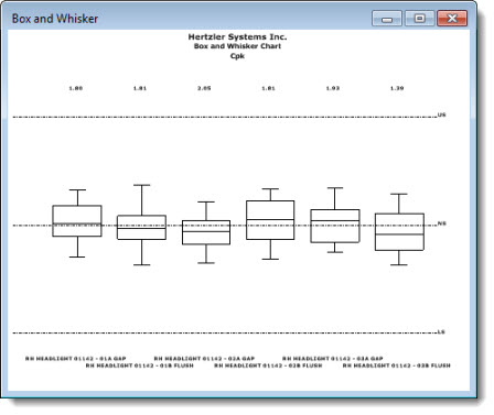
This topic details chart types for summary charts that feature multiple retrievals all in one chart window.
For available individual SPC chart descriptions, see SPC individual chart types
|
Contents [Hide] |
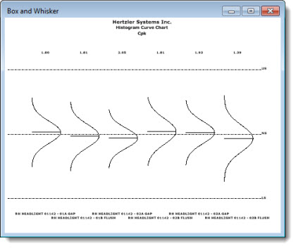
The Process Capability Chart helps define the data distribution by illustrating minimum and maximum values in relation to the median. A Histogram Curve Chart (Fig. 1) is the traditional default chart type that opens in GainSeeker when a new Process Capability Chart chart is drawn. However, the chart type can be changed to display a Box and Whisker chart (Fig. 2) or one of several other chart types in the GainSeeker Administration module.
Fig. 1Fig. 2
The Combined Control Chart enables comparison of the subgroup averages from multiple retrieval groups that share a similar combination of date/time stamp and/or traceability values. You can also configure GainSeeker to group similar date/time retrievals, compare specific traceability fields, or sort data by other traceability values. See Colors that identify standards in this topic.
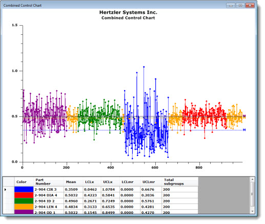
To help distinguish each standard on the chart, GainSeeker assigns a color to each. The table under the chart features a color key to help you quickly identify a standard and the data associated with it:
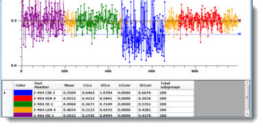
The colors are assigned to the standards in a revolving cycle in the order shown in the following table. For example, if your system has been set to use Medium Slate Blue as the color for the first standard, then Yellow, Dark Turquoise, Dark Red, and Lime would be used to denote the second, third, and fourth standards, respectively.
|
Color |
Example |
|
Blue |
|
|
Red |
|
|
Green |
|
|
Orange |
|
|
Dark Magenta |
|
|
Gold |
|
|
Navy |
|
|
Orange-Red |
|
|
Dark Green |
|
|
Tomato |
|
|
Medium Slate Blue |
|
|
Yellow |
|
|
Dark Turquoise |
|
|
Dark Red |
|
|
Lime |
|
|
Chocolate |
|
|
Fuchsia |
|
|
Olive |
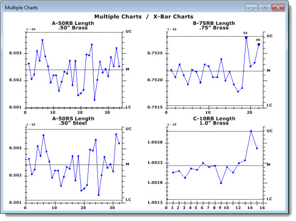
Use a Multiple Chart to display charts for multiple standards or retrievals in a single window.