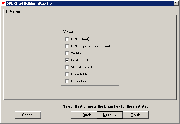
On the chart Views tab, select whether you want to see a DPU chart with or without a user-specified improvement line, a Yield chart, a Cost chart, a Statistics list, a Data table or Defect detail. You can select any combination of these options.
If you draw more than one chart, the program displays them on the screen in a cascade. You can then maximize one and minimize the others to view the charts individually.

The views listed here give you information in either a chart or table:
|
Charts |
What information it contains |
|
Defects Per Unit (DPU) |
Displays defect levels of your process(es) over time. |
|
DPU Improvement |
Displays defect levels of your process(es) over time against a user-specified improvement curve. Default improvement curve is 10x, a value which can be modified in the Administration module. For example, a 10x-improvement curve represents a goal of reducing defects by 10 times in two years and 100 times in four years. |
|
Yield |
Displays yield levels of your processes over time. This shows you how the percentage of good units changes over time. |
|
Cost |
Displays the cost of defects or defective units over time. The way that costs are calculated will depend on the Use cost information from setting on Step 4. |
|
Tables |
What information it contains |
||
|
Statistics list |
A table displaying statistics you have chosen as relevant for your data. |
||
|
Data table |
Shows the data used to create the chart:
* Your traceability labels may differ and you may use up to 42 additional traceability fields. |
||
|
Defect detail list |
Contains the information that goes into making the plot point for a chart:
|