Creating a Paired Sample Chart
|
 Note: This topic contains information about the legacy SPC Charts and Reports module, which is being phased out from GainSeeker Suite. It is still available for use, but is being replaced by Paired Sample Analysis in the newer GainSeeker Charts module. Note: This topic contains information about the legacy SPC Charts and Reports module, which is being phased out from GainSeeker Suite. It is still available for use, but is being replaced by Paired Sample Analysis in the newer GainSeeker Charts module.
|
A Paired Sample Chart allows you to compare any two variables and plot them against each other, in order to find a relationship between the two.
GainSeeker creates the Paired Sample chart by retrieving data for the two standards you specify and pairing the last data record from both retrievals, the next-to-last record from both retrievals, etc. Each of these data pairs is then plotted on the chart.
Getting started:
To create a Paired Sample Chart, click the File menu and then click Paired Sample Analysis. This will display the Quick Chart -- Step 1 of 2 screen.
Selecting two variables to compare:
In the Part Number list, find a standard you want to analyze on the Paired Sample chart. Double-click this standard, or highlight the standard and then click Copy to 'Selected values', to add this standard to the Selected values list. This first standard will be plotted along the x-axis of the chart.
Repeat these steps to select the second standard, which will be plotted along the chart's y-axis.
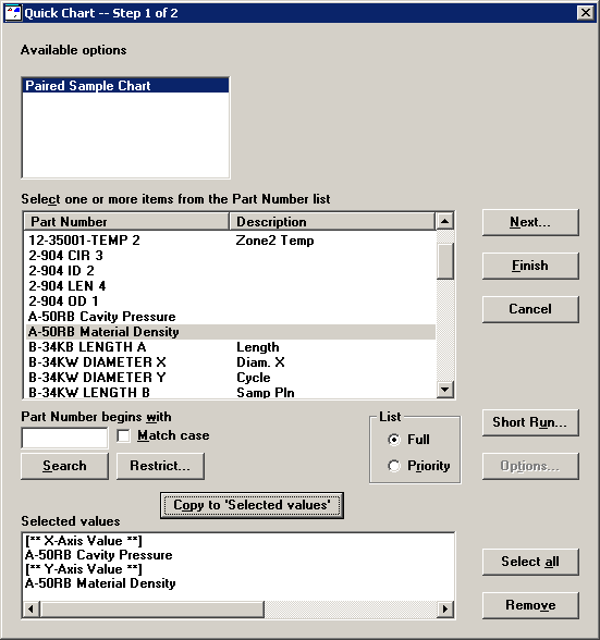
If you accidentally selected the wrong standard, highlight that standard in the Selected values list and then click Remove. To remove both standards, click Select all and then click Remove.
To set retrieval and statistical options, click Next. Otherwise, to generate the Paired Sample chart without changing retrieval or statistical options, click Finish.
Setting retrieval and statistical options:
If you clicked Next, GainSeeker will display the Quick Chart -- Step 2 of 2 screen.
To set retrieval and statistical options for a single standard, highlight that standard in the Selected values list. To set options for both standards, highlight both standards.
For information about individual retrieval options and statistical options, see Quick Chart Step 2.
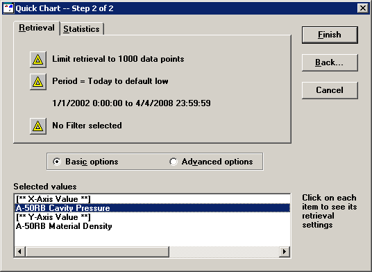
After setting these options, click Finish to retrieve the data and display the Paired Sample chart.
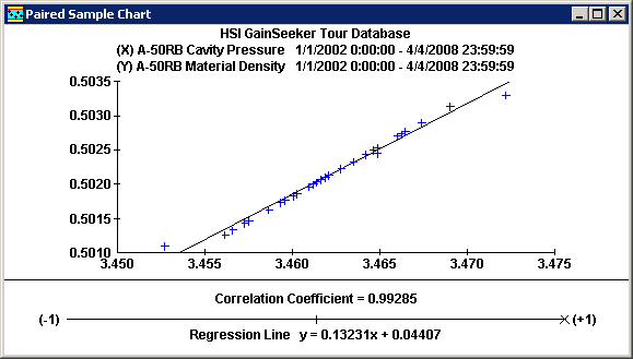
Interpreting the Paired Sample chart
-
-
When the best-fit line is flat and the Correlation Coefficient is close to 0, this indicates that there is no correlation between the two variables.
-
When the line slopes downward and the Correlation Coefficient is close to -1, this indicates an inverse correlation between the two variables.
-
When the line slopes upward and the Correlation Coefficient is close to 1, this indicates a direct correlation between the two variables.
The sample chart above indicates a direct correlation between the two variables being analyzed.