You can change the default settings for SPC charts in the GainSeeker System Administration module. Customizing these options to meet your organization's needs can make routine analysis and charting activities faster and more convenient.
Most of these options can also be temporarily changed for a chart using the Settings tab when a chart is first drawn or when it is open.
Settings tab settings are temporary in that each time the GainSeeker Charts module is closed, the settings revert back to the default settings established in the GainSeeker System Administration module .
|
Contents [Hide] |
Navigate to the SPC chart defaults settings on the Configurations tab of the System Administration module by following this path:
Configurations | (configuration | Chart defaults | SPC
Use this setting to apply a chart skin to charts drawn for SPC retrievals. The default chart skin can be temporarily overridden by users from the Settings tab.
Chart skins included with GainSeeker are added to each configuration when the System Administration module is initially loaded and to any new configurations you might add.
You can also create and name your own skins, which can have practical advantages on decision-making based on data when analysts see data displayed the same way. For more information, See Chart Skins
Control chart limits
Select the limits to display on Control charts. See Control chart limits
Draw bar charts for subgroup and range values
Adds a bar chart showing subgroup and range values to charting windows when checkbox is selected. See Draw bar charts for subgroup and range values
Draw individual data points for each subgroup
Displays individual data points representing each subgroup on the chart when checkbox is selected. See Draw individual data points for each subgroup.
Draw range chart
Includes a range chart on the charting window. See Draw range chart
Range chart limits
Select the Control range chart limits to display. See Control range chart limits
Show sigma stripes
Displays sigma stripes on charts when this checkbox is selected.

Acceptance limit based on
Select the limit from which the acceptance limit is calculated. See Acceptance limit based on
CuSum chart limits
Select limits to display on a CuSum/Control X-bar chart See CuSum/Control chart limits
Decision interval value =
Determine the value used to calculate the upper and lower CuSum value for data subgroups. See Decision interval value
Range chart limits
Select the limits to display on a CuSum range chart. See Range chart limits
Show C1/C2 zone
Displays the C1/C2 zone (the area between C1 and C2) as a shaded area on the chart when this checkbox is selected.
Show sigma stripes
Displays sigma stripes on charts when this checkbox is selected.
Start value constant =
This value is used to calculate the upper and lower CuSum value for a data subgroup when that subgroup is the first in the data set retrieved. It is also used in the upper or lower CuSum calculation when the previous CuSum value exceeded the acceptance limit. See Start value constant
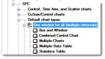
Select the default chart types to draw for single charts (one chart window for each retrieval) and multiple retrieval charts (one window for all retrievals). See Selecting SPC Chart types for more information.
One window for all (multiple retrievals)

One window for each


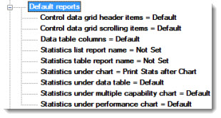
Select statistics and other information to display with charts. See Default reports for information about all of these settings.

Choose whether to draw X-axis (vertical gridlines) or Y-axis (horizontal gridlines on a chart. See Divider and grid lines

EWMA chart limits
Displays selected limits on an X-bar EWMA chart. See EWMA chart limits
EWMA weight
Determine the weighting factor for EWMA charts. A typical factor is 0.15 . See EWMA weight
Show Sigma stripes
Displays sigma stripes on charts when this checkbox is selected.
Determines how data will be grouped. See Group data on control, CuSum and Performance charts

Histogram or Normal Probability Plot limits
Displays these limits on a Histogram or Normal Probability Plot chart. See Histogram or Normal Probability Plot limits
Set the upper limit for the number of data records to retrieve for each selected standard. See Maximum count for retrieval
This setting determines whether the Monitor Table row colors are based on Real-time failure colors or on rules that you define, based on traceability and corrective action values in the data.

If you choose User-Defined Colors, use this window to create and manage the rules for those colors.

For each color rule, choose a Field (traceability, Event, Cause, or Action Taken) and choose the Value you are searching for in that column. Then choose the color that should be applied to the rows where the Field you chose equals the specified Value.
Use the arrow buttons (Top,
Up, Down,
Bottom) to set the priority of
color rules (topmost = highest priority). This is used when any row meets
the criteria for multiple color rules.
For example, using the settings pictured above, a row of data with both
Event = "Burn on Parts" and Cause = "New Material lot"
would be displayed in orange because the rule for the Event is set with
a higher priority (higher on the list) than the rule for the Cause.
The Default
color is used by rows that do not meet the criteria of any of the other
rules. You can change the color for this rule but not delete it or change
its priority.
For example, using the settings pictured above, a row of data that does
not have Event = "Burn on Parts" or Cause = "New Material
lot" would be displayed in green (the color of the Default rule)
because it does not meet the criteria for any of the other rules listed.
See Maximum count for each standard
See Table Mode

For information about these settings, see Moving average chart limits and Moving average span

For information about these settings, see Multiple Charts options and Process Capability chart options
The Limits to Display settings apply to the Paired Sample chart.
The Traceability grouped by setting applies to the Paired Sample chart and the Paired Sample Grid dashboard control.

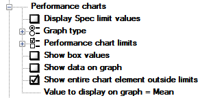
See Performance chart options for information about the following settings:
Display Spec limit values
Graph type
Show box values
Show data on graph
Show entire chart element outside limits
See Performance chart limits for information about the following topic:
Performance chart limits
Set default options for colored chart borders that indicate the presence of real-time failures on those charts. See Real-time failure border settings
Set the zones on which the sigma stripes will be based. See Sigma stripes based on
Select the limits to display on Trend charts. See Trend chart limits