Select DMS chart types for a Dynamic Report.
|
Contents [Hide] |
Available for One chart for each retrieval category only on the DMS Report Retrieval Settings dialog.
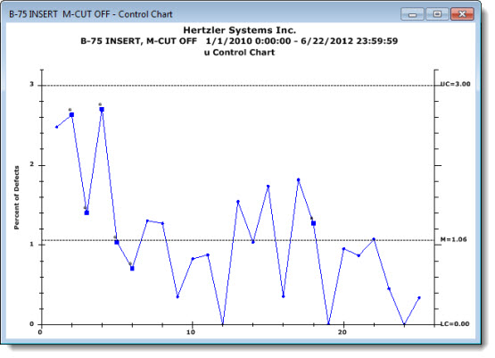
Control Charts help determine if defects are within the set control limits. Defect data is plotted over time.
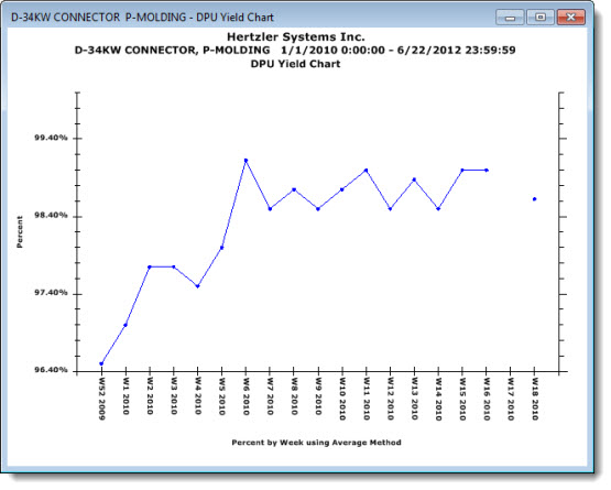
DPU (Defects Per Unit) Charts group data by a selected time period and plots it at a single data point representing each successive time interval. Depending on your default setting in the GainSeeker Administration module, data is grouped by the hour, day, week, month, or quarter.
There are three types of DPU charts from which you can select in the One chart for each retrieval category and the One window for all retrievals category on the DMS Report Retrieval Settings dialog box.
DPU Charts |
What information it contains |
DPU Chart |
Displays defect levels of processes over a time interval using a chart format. |
Yield Chart |
Displays yield levels of your processes over time and shows how the percentage of good units changes over time. |
Cost Chart |
Displays the cost of defects or defective units over time. Costs can be calculated on the basis of cost per unit (using the cost from the standard), cost per defect (using the cost from the defect), or cost per sample (using a traceability field to store the actual cost for each data record). |
An example of a DPU Yield Chart follows in which grouped data is plotted by weeks.
OEE (Overall Equipment Effectiveness) can help you determine what percentage of your planned production time is being fully utilized. OEE is a DMS (Defect Management System) function.
OEE charts available are:
See also: Introduction to OEE
When you group the data by a traceability for primary or secondary groupings on OEE charts in a Dynamic Report, you must include that traceability field in your DataDetail by selecting it on the Columns tab of the DMS Report Retrieval Settings dialog.
The Group data for OEE chart by dialog lets you group data by a specific time period or by a traceability item you select. You can also select a second-level grouping, which lets you display two groupings as a grouped bar plot on a single chart. This setting temporarily overrides the default setting.
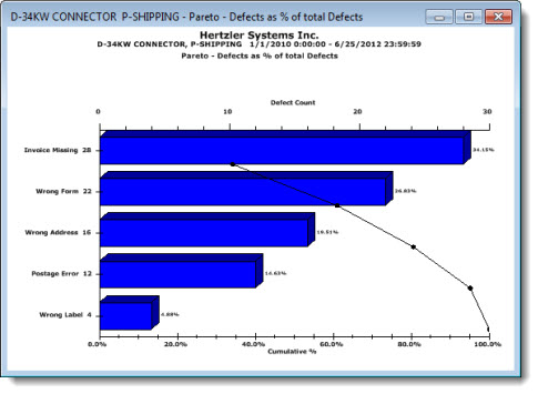
Pareto Charts allow you to group data categorically, such as by cost or defects.
There are six types of Pareto Charts from which you can select in the One chart for each retrieval category and the One window for all retrievals category on the DMS Report Retrieval Settings dialog. They include:
An example of a Pareto - Defects as % of total Defects chart follows: