This topic details chart types for individual retrievals: one chart for each retrieval. For available multiple retrieval charts: one chart window for all retrievals, see SPC Summary chart types
|
Contents [Hide] |
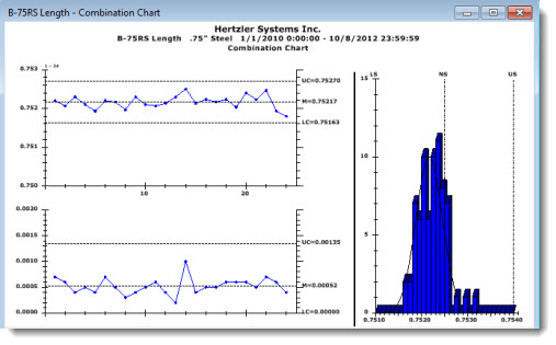
The Combination Chart shows a combination of charts in one window as in the following example that features X-Bar and R Chart Control Charts on the left, a Histogram on the right.
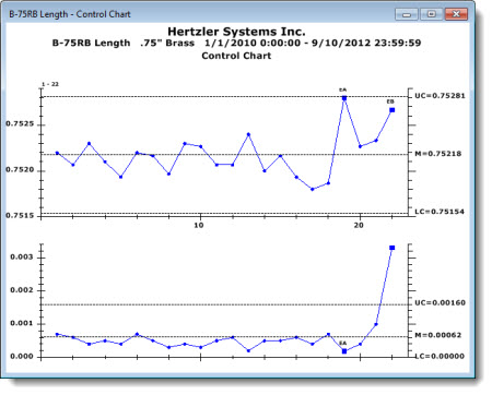
A Control Chart is one of the most commonly used tools for basic process control because it can help distinguish between common-cause and special-cause variations.
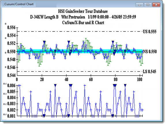
A CuSum Chart displays the cumulative sum of the deviation of each subgroup average (![]() ) from the target value. It is sensitive to small shifts away from the target.
) from the target value. It is sensitive to small shifts away from the target.
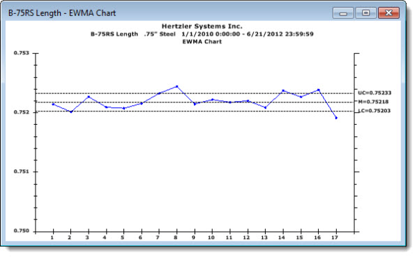
The EWMA (Exponentially Weighted Moving Average) Chart uses a weight value to create a moving average. It provides a better representation of batch processes by letting you examine the influence of prior data points on a current sample. It allows for smoothing of data, normalizing the effects than an out-of-control spike will have on a data set.
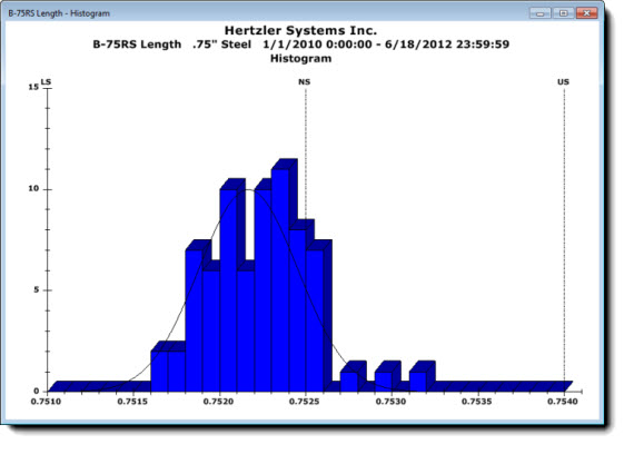
A histogram uses bars to display the distribution of individual points in a data set in an easy-to-read format. Comparing this distribution to set specification limits can help users understand the current process capabilities. A standard normal distribution should approximate the shape of a bell curve in most instances.
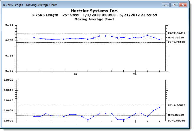
A Moving Average chart gives a good representation of batch processes by letting you examine the influence of prior data points on a current sample. It allows you to smooth data, normalizing the effects that an out-of-control spike will have on a data set by averaging two or more consecutive data points.
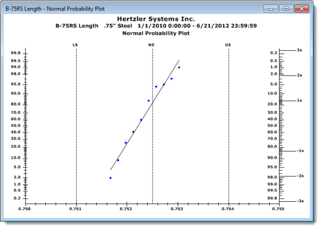
Use the Normal Probability Plot Chart to determine if a data set follows the normal distribution. Data points should plot in a linear pattern that approximates the straight line—the theoretical normal data distribution. Use the Normal Probability Plot chart to quickly spot potentially non-normal situations when the plotted data trends away from the line. See example below.
Potentially non-normal distributions
A non-normal data distribution may be indicated by data points that do not plot along the approximate axis as the Normal Probability Plot line, but which curve away from it in either direction.
Examples of potentially non-normal distribution patterns
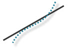 Data has "long tails." Data curves upward from under the line and continues in an upward trend over the line suggesting long "tails" and greater-than-normal variance.
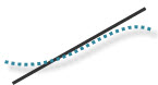 Data forms S-shaped "short tails." Data points plot in an S-shaped curve suggesting short "tails" and a less-than-normal variance.
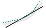 Right-skewed data. Data points plot by bending in an upward trend to the left of the line suggesting points outside specification limits.
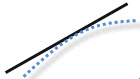 Left-skewed data. Data points plot by bending in a downward trend to the right of the lines suggesting points outside specification limits.
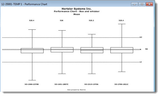
A Performance Chart helps define process capability using quartiles by grouping data by a traceability value (for example, Machine in the following chart example). This allows for quick visual comparison of data groups by mean and variation.
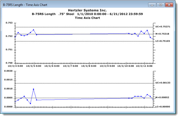
The Time Axis Chart is helpful in ensuring that operators are collecting data at designated times. Unlike a standard control chart, the Time Axis Chart scales the X-axis by a fixed interval of the date/time stamp on data records.
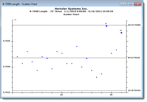
A Scatter Chart is a good tool for tracking trends and understanding process shifts over time. It can be used to spot a possible correlation between two variables that relate to the same event.
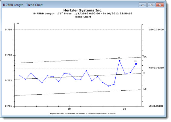
Similar to the Scatter Chart, a Trend Chart plots data points to detect trends. Control limits and the mean are calculated from the linear regression line. Knowing the trend of a process can help to predict when the process may run outside gate limits or specifications.
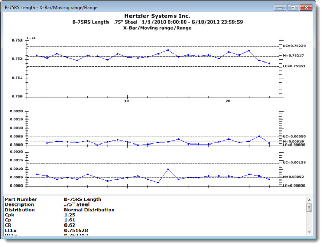
The X-Bar/Moving range/Range Chart plots X values, range, and moving range all on one window.