Note: Colors
and Patterns settings and all other settings located in the Chart
overrides node of the Settings
dialog can be saved as a chart skin that you can apply to any charts.
For more information, see Chart Skins
Note: Colors
and Patterns settings and all other settings located in the Chart
overrides node of the Settings
dialog can be saved as a chart skin that you can apply to any charts.
For more information, see Chart SkinsUse the Colors and Patterns settings to select colors and patters for chart elements.
Note: Colors
and Patterns settings and all other settings located in the Chart
overrides node of the Settings
dialog can be saved as a chart skin that you can apply to any charts.
For more information, see Chart Skins
To temporarily override any default settings for charts, navigate to the Colors and Patterns settings on the Settings tab following this path:
Chart overrides | Charts | Colors and Patterns
For help with using expandable tree structures, see Navigating Tree Structures
To set default property settings for a configuration, navigate to the Colors and Patterns settings following this path on the Configurations tab of the System Administration module:
Configurations | (Configuration Name) | Chart defaults | Shared (DMS and SPC)
Designate the background colors for even rows on a:
This setting is dependent on other settings being selected. For more information, see Alternate row colors
Designate the background colors for odd rows on a:
This setting is dependent on other settings being selected. For more information, see Alternate row colors
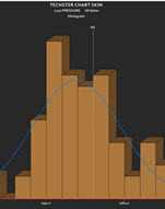
Set the color for the bars on charts as in the following example:
Set the pattern for bars on charts that display bars. The Diagonal cross pattern is selected for this histogram chart example. The bars are set to a blue color using the Bar color = option, and to three-dimensional display using Bars drawn in 3D.
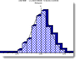
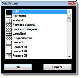
Double-click Bar pattern = to open the Data Pattern dialog box. Click a pattern to select it.
Charts with bars—such
as Pareto charts—display
a three-dimensional appearance if the checkbox ![]() preceding
this option is selected.
preceding
this option is selected.
See Fig. 1 above for an example using this option.
Set the background color of the charting window.
You can also set the color that displays in the plot area of the chart. See Plot background color setting
In the following example, the Chart Background color has been changed to orange.
Note: The Normal Probability Plot chart only uses the Plot Background Color. The Graph Background Color setting is not used.
Add an image to the background of a chart. In addition to making your data analysis more visually engaging, it can serve a practical purpose.
For more information, see Chart background image
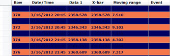
If enabled, this uses the real-time failure colors and priorities to indicate real-time failure data on SPC data tables and multiple data tables.
For a data table, any subgroup that exhibited a real-time failure will display the highest priority color on the entire row.
For a multiple data table, any subgroup that exhibited a real-time failure will display the highest priority color in the cells for data values, X-bar, Range, and Moving Range.
For any real-time failure color that is too dark for text to be legible using the font color settings, any rows or cells that display those colors will display text in white font.
Change the color for CuSum bars on a CuSum/Control Chart. A CuSum chart displays the cumulative sum of the deviation of each subgroup aver from the target value. It is sensitive to small shifts away from the target.
Change for color for the C1/C2 band on CuSum Control charts.
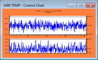
Change the color of the plotting area of a chart.
You can also change the Chart background color (white background area in the example below)
In the following image, the Plot background color is changed to yellow:
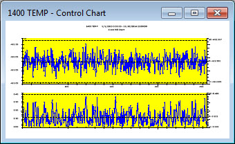
Note: The Normal Probability Plot chart only uses the Plot Background Color. The Graph Background Color setting is not used.
Change the default settings Chart cycle colors for the Pareto drill down function and Combined Control charts.
For more information, see Cycle colors in GainSeeker
Note: This
setting is only available on the GainSeeker System
Administration module.
Set the colors for these sigma stripe zones on a chart:
Sigma stripe all inside two sigma
Sigma stripe between two and three sigma
Sigma stripe outside three sigma
These settings and all other settings in the Charts overrides node of the Settings tab can be saved as a Chart Skin