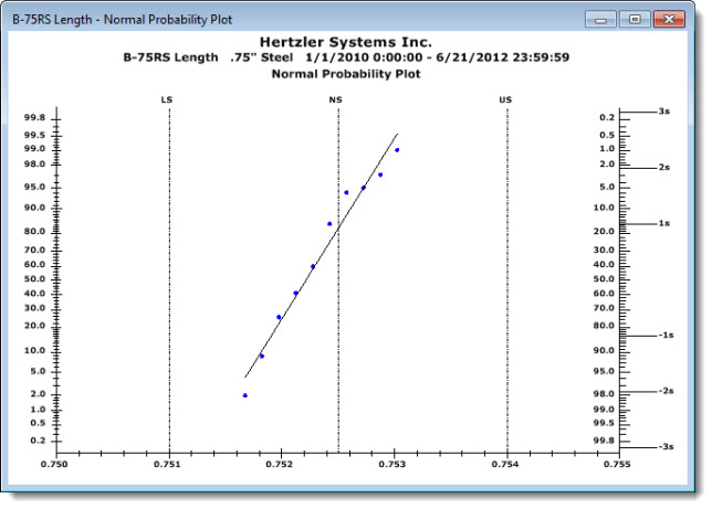
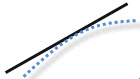
The Normal Probability Plot chart helps you quickly recognize potentially non-normal distributions. Data points should plot in a linear pattern that approximates a straight line along the axis of the theoretical normal data distribution. Non-normal situations may be indicated by data trending away from the line. See examples below.
|
Contents [Hide] |
A non-normal data distribution may be indicated by data points that do not plot along the approximate axis of the Normal Probability Plot line, but which curve away from it in either direction.
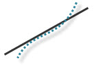 Data
has "long tails." Data
curves upward from under the line and continues in an upward trend over
the line suggesting long "tails" and greater-than-normal variance.
Data
has "long tails." Data
curves upward from under the line and continues in an upward trend over
the line suggesting long "tails" and greater-than-normal variance.
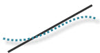 Data forms S-shaped "short tails." Data points plot in an S-shaped curve suggesting short
"tails" and a less-than-normal variance.
Data forms S-shaped "short tails." Data points plot in an S-shaped curve suggesting short
"tails" and a less-than-normal variance.
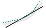 Right-skewed data.
Data points plot by bending in an upward trend to the left of the line
suggesting points outside specification limits.
Right-skewed data.
Data points plot by bending in an upward trend to the left of the line
suggesting points outside specification limits.
 Left-skewed
data. Data points plot
by bending in a downward trend to the right of the lines suggesting points
outside specification limits.
Left-skewed
data. Data points plot
by bending in a downward trend to the right of the lines suggesting points
outside specification limits.
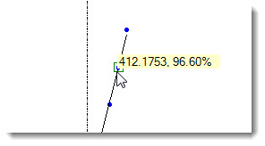
You can click any data point or limit line to display its value.
The Normal Probability Plot chart only uses the Plot Background Color. The Graph Background Color setting is not used.
See Skip single charts with no data to set GainSeeker so that charts for standards that have no data will not be displayed. For example, if you select charts for five standards and only three have data, only three will display. This setting only applies to charts type listed in the One window for each retrieval group (the left) column above.