The Big Data Analytics SPC and Big Data Analytics DMS dashboard controls use the Define Region Colors dialog to set a specific color for data records that fall within limits you specify. Setting colors can help you quickly identify a specific data range at a glance.
For Big Data Analytics SPC dashboard controls, the Define Region Colors dialog opens from the RegionsContinuous property.
|
Contents [Hide] |
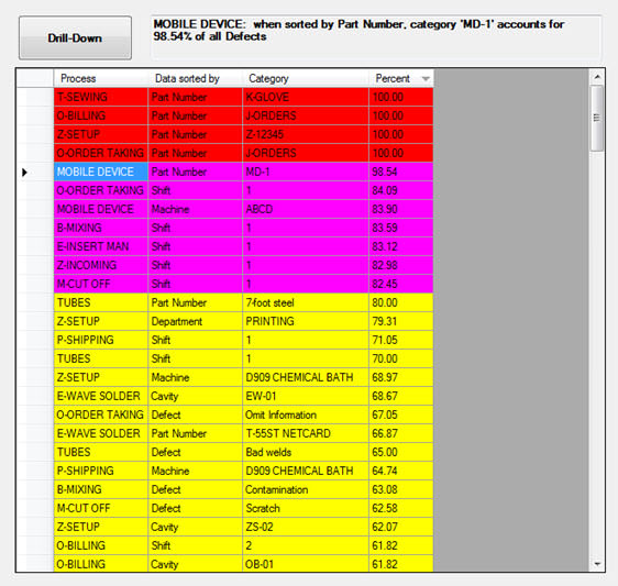
When the results are sorted by Percent on this running Big Data Analytics DMS dashboard control (Fig. 1), all data records between 80 and 99.9 are grouped together and display the color purple in the grid. Acceptable limits are also set for other colors on the grid.
Note: Clicking a column header sorts the data in the grid by the column header label, Percent in this example. See Fig. 2 below.
See how to set the color region properties on the Big Data Analytics DMS and Big Data Analytics SPC dashboard controls.
Fig. 1
You can sort the list items by any of the column headers, as in this example where the list items are sorted by traceability. Each time a header is clicked, the items re-sorts by a different traceability, Process, or Percent, for example. The items in this example is sorted by traceability. Also notice that the interpretation for the selected row, P_MOLDING in this example, displays adjacent to the Drill-down button.
Fig. 2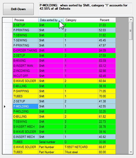
To set the RegionsContinuous (for SPC) or the Regions (for DMS) property:
Click the RegionsContinuous or Regions property value cell on the properties grid for that control. See Big Data Analytics dashboard control properties
Then, click the ellipsis button ![]() in the value cell.
in the value cell.
The Define Region Colors dialog opens.
For DMS retrievals, the Defined regions must range from 0 to 100 (percent). For example, in the image below for a DMS retrieval, five different regions have been defined that step through all percentages from 0 to 100%.
For SPC retrievals, the Defined regions must range from 0 to 1 (correlation). For example, you could set four different color regions with regions ranging from 0 to .25, .25 to .50, .50 to .75, and .75 to 1.
The Defined regions field on the Define Region Colors dialog in this example contains five defined background color regions—green, grey, yellow, purple, and red.
The purple row in this example is selected. This is indicated by the highlighted arrow preceding it and the white text color that has changed from black. The start value for color Number field is set to 80 and the End value for color Number field is set to 99.9, the acceptable data range that is set for this row. This color will display on the dashboard control for the region containing data that meets the set numeric criteria. The same is true for all other data ranges that set to correlate with specific colors.
You can change the numeric text values using the Start value . . . and End value . . . fields.
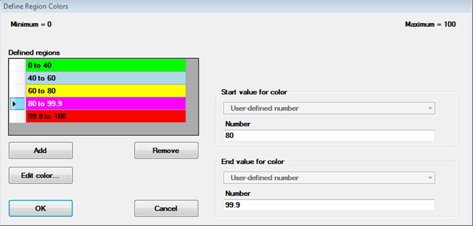
You can change the color for a region in the Define regions field by clicking on it to select it, and then clicking Edit color... . This displays the Color dialog used to select colors.