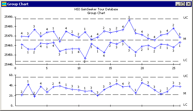
This tool uses one control chart to compare similar subprocesses that are running simultaneously. For example, the chart below compares data from four cavities on one machine. The X-Bar chart plots the low subgroup average and the high subgroup average at each common date/time stamp. The Range chart plots the subgroup range for the part number with the most variability. The Group Chart ignores all other subgroup averages and ranges.
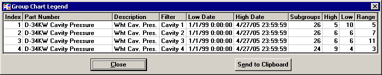
The legend reports the number of times each retrieval group shows up as the high or low value on the chart. This display can help you to pinpoint quickly and easily the special causes of variation in similar processes.
To view the legend, right-click on the chart or click the Options menu. Then select Legend from the menu.