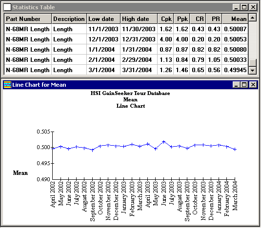
After generating a statistics table with rows in chronological order – for example, by using Chart Designer to create a report based on multiple date ranges – it is possible to draw a chart of the consecutive values of a statistic from your table.
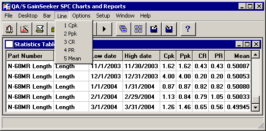
When a statistics table with rows in chronological order is displayed on the screen, the Line menu appears. From this menu, you can choose to draw a line chart of any numeric statistic already displayed in your statistics table.
|
|
If the statistic you choose has values that are not set – displayed as “NA” or “None” – the corresponding points on the line chart will be skipped.
The line chart can be saved as part of a desktop.