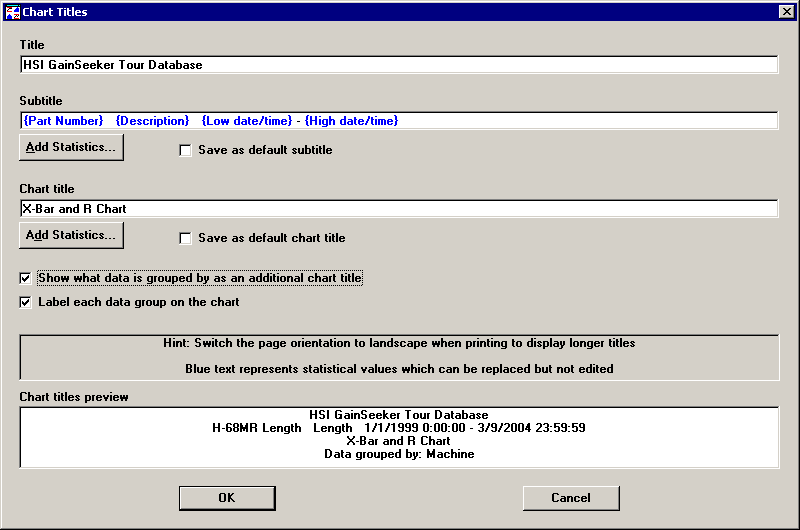
When a control chart displays grouped data, you can display an extra line to the chart title that describes how the data is grouped. You can also choose to display labels identifying each data group.
To modify these display options for grouped data, right-click on the chart and then click Chart Titles.
To add a line to the chart title describing how the data is grouped, select the Show what data is grouped by as an additional chart title check box. The Chart titles preview box shows you how your chart titles will look with the settings you have chosen. In the example above, selecting this check box adds the line “Data grouped by: Machine” to the chart title.
If you prefer not to add a new line to the chart title, another option is to click Add Statistics for the subtitle or chart title, then add the statistic “Data grouped by” to the Selected Statistics list. For more information on changing chart titles, see Changing SPC Chart Titles.
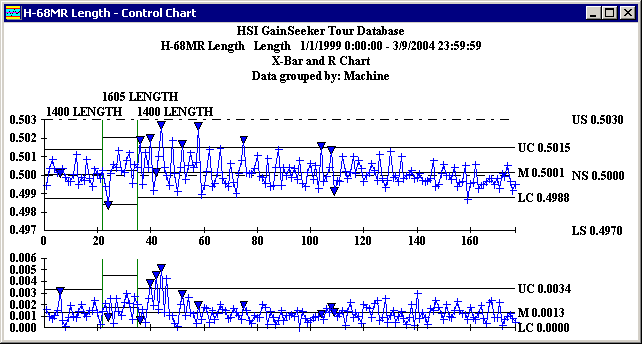
To display labels identifying each data group on the control chart, select the Label each data group on the chart check box. This will display a unique identifier above the first subgroup of each new data group on the X-bar or X chart. This option is probably most useful for data grouped by traceability values or date/time periods. In the sample chart below, the first data group is identified with machine 1400 Length, the second with 1605 Length, and the third with 1400 Length.
However, you can also display labels for data grouped by anchor point or by manual selection. For this type of data grouping, the label simply displays the subgroup numbers contained in the data group, as shown in the sample chart below.
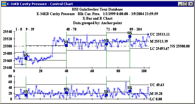
The data group labels will use up to three lines to avoid overlapping. If the labels are too long and the groups are too short, the labels may overwrite each other and become unreadable. At this point you must decide whether to turn the labels off, choose another grouping method, or to retrieve less data.