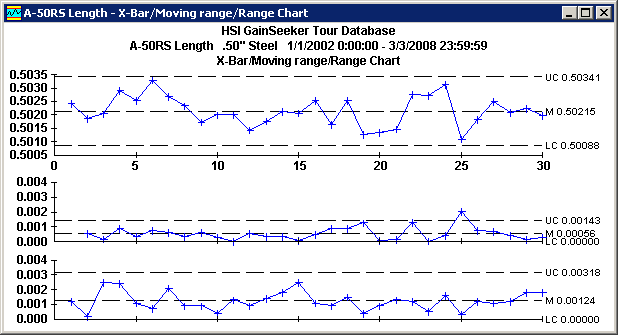
On this chart, the Moving Range (or Moving Sigma) plot helps you to analyze the variation between subgroups, while the Range (or Sigma) plot helps you to analyze the variation within subgroups.

This chart displays your data in three ways:
Top chart
For subgrouped data, the top chart plots the subgroup averages (![]() ).
).
For individuals data (data with a subgroup size of 1), the top chart plots the individual data points (X).
Middle chart
For subgrouped data, the middle chart plots the difference between the previous subgroup average (![]() ) and the current subgroup average.
) and the current subgroup average.
For individuals data (data with a subgroup size of 1), middle chart plots the difference between the previous data point and the current data point.
Depending on the way the standard is configured, these differences may be displayed as Moving Range or Moving Sigma values.
Bottom chart
For subgrouped data, the bottom chart plots the difference between the highest and lowest values for each subgroup. Depending on the way the standard is configured, these differences may be displayed as Range (R) or Sigma (s) values.
For individuals data, the bottom chart is not available.