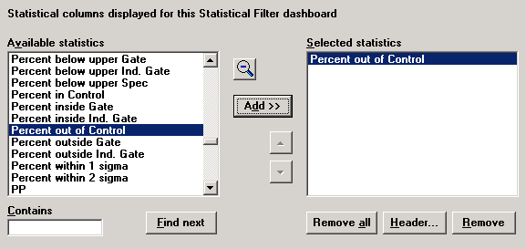
Browse the Available statistics list for the statistic you want to display.
By default, an abbreviated list of statistics is displayed. If you cannot find the desired statistic, click the ![]() button to select from the full list of statistics.
button to select from the full list of statistics.
On the Columns tab, you can specify the statistics to display on the dashboard. Each statistic will be displayed in its own column.
To define one or more columns:
Browse the Available statistics list for the statistic you want to display.
By default, an abbreviated list of statistics is displayed. If you cannot find the desired statistic, click the ![]() button to select from the full list of statistics.
button to select from the full list of statistics.
For a statistical filter of variable data, this list includes several charting options: Sparkline, Chart, Chart (2x height) and Chart (4x height).
Chart scaling:

● The Sparkline is always scaled to the minimum and maximum data points, and no limits (e.g., Control or Gate) are displayed.
● The Chart, Chart (2x height) and Chart (4x height) are scaled according to data points and/or limits as follows:
Choosing the limits:
If the chart defaults for the current configuration are set to display Gate limits but not Control limits, then these charts will use the Gate limits and/or data to scale the chart. Otherwise, these charts will use Control limits and/or data to scale the chart.
Scaling the top of the chart:
The top of the chart will be scaled to the maximum data point or the upper limit, whichever is higher. (If using Gate limits and the upper Gate limit is not set for this standard or process specification, then the top of the chart will be scaled to the maximum data point.)
The upper limit will be only displayed on the chart if the maximum data point falls above this limit.
Scaling the bottom of the chart:
The bottom of the chart will be scaled to the minimum data point or the lower limit, whichever is lower. (If using Gate limits and the lower Gate limit is not set for this standard or process specification, then the bottom of the chart will be scaled to the minimum data point.)
The lower limit will be only displayed on the chart if the minimum data point falls below this limit.
Chart height:
● The Sparkline and Chart are sized to the same height as the font used for the dashboard.
● The Chart (2x height) is sized to two times the height of the font used for the dashboard.
● The Chart (4x height) is sized to four times the height of the font used for the dashboard.
Chart width:
The chart width is automatically sized to six times the height of the chart. This can only be changed by viewing the dashboard, dragging the column header to change its width, changing the design of the dashboard and locking the column width.
The data mean is displayed on all charts.
You cannot change the colors or line types used to display the data or limits.
|
|
For a statistical filter of attribute data, this full list contains two types of statistics:
Most statistics will display information for all defects found on each row of the statistical filter. This is true for all statistics except those beginning with "[Detail]".
Statistics that begin with "[Detail]" will only display meaningful information if exactly one defect is selected on the Detail Defects tab. These statistics will display information for only the selected defect.
If you must display one of these [Detail] statistics, best practice is to add the name of the selected defect to the Column header.
Click the desired statistic in the Available statistics list, and then click Add. Alternately, you may double-click the desired statistic.
The item you chose is added to the Selected statistics list.

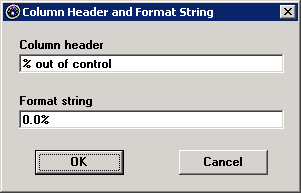
While this item is highlighted in the Selected statistics list, you can click Header to customize the contents of this column:
Column header
This text will be displayed at the top of the column.
This will format the statistical values displayed in this column. For valid format options, see Numeric formats, String formats and Date/Time formats.

To define additional columns, repeat the steps above.
When the dashboard contains multiple columns, you can change the order in which they appear on the dashboard. To do so, click one item in the Selected statistics list and then click the ![]() or
or ![]() button to change its position in the list.
button to change its position in the list.
A statistical filter dashboard of attribute data will use the default statistical settings for this configuration. However, if the configuration is set to Bypass cost to improve speed, you can override this option so that cost statistics will be calculated and displayed on dashboards. For more information, see Overriding the "Bypass cost" setting.