The Linechart and Barchart commands in Python™ allow you to draw a simple line chart or bar chart in a custom dashboard or in a Python script in PC Collect.
See Python commands for other commands you can use with GainSeeker.
Note: While the root command linechart is used in this table, the barchart chart command also shares these properties and methods.
Syntax |
Example |
Description/Remarks |
New or changed in GainSeeker version |
linechart.addtopane(index=0, row=0, column=0, height=1, width=1) |
linechart.addtopane() linechart.addtopane(0, row=1, column=2, height=2, width=1) |
Adds the chart form created by the disp (Display) command at the specified pane index. Row, column, height, and width arguments correspond with the properties for other form controls of the same name. See Form Basics. |
|
linechart.addydata(data, label) |
linechart.addydata([3, 4, 5], "Production") |
Adds a group of y data to the chart, specified by the data argument. The label argument sets the label for the group of data. For a missing data value, specify None. |
|
linechart.chartskin |
linechart.chartskin = "Data Head" |
Gets or sets the SPC chart skin for the chart. DMS chart skins are not available with this command. Chart skin names are case sensitive. |
|
linechart.clear() |
linechart.clear() |
Clears all chart data from the chart command object. |
|
linechart.manualscaleyaxis |
linechart.manualscaleyaxis = True |
If set to True, the yscalelow and yscalehigh properties are used to scale the y-axis of the chart. |
|
linechart.setxdata(data, isnumeric) |
linechart.setxdata(["Jan", "Feb", "March"], False) |
Sets the x data for the chart. Labels may also be used if isnumeric is False, in which case the data is displayed sequentially. |
|
linechart.title |
linechart.title = "My Chart" |
Gets or sets the chart's primary title. |
|
linechart.xaxistitle |
linechart.xaxistitle = "Month" |
Gets or sets the x-axis title. |
|
linechart.yaxistitle |
linechart.yaxistitle = "Count" |
Gets or sets the y-axis title. |
|
linechart.yscalehigh |
linechart.yscalehigh = 10 |
Gets or sets the maximum y value displayed if manualscaleyaxis is True. |
|
linechart.yscalelow |
linechart.yscalelow = 0 |
Gets or sets the minimum y value displayed if manualscaleyaxis is True. |
|
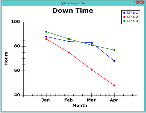
This is an excerpt from a sample script that would draw a line chart similar to that shown below:
#set linechart properties and data
linechart.title = "Down Time"
linechart.addydata([88, 84, 83, 68], "Line 1")
linechart.addydata([86, 75, 61, 48], "Line 2")
linechart.addydata([92, 86, 81, 77], "Line 3")
linechart.setxdata(["Jan", "Feb", "Mar", "Apr"], False)
linechart.xaxistitle = "Month"
linechart.yaxistitle = "Hours"
#add chart to the current disp pane
linechart.addtopane()
#display chart
disp.show()
