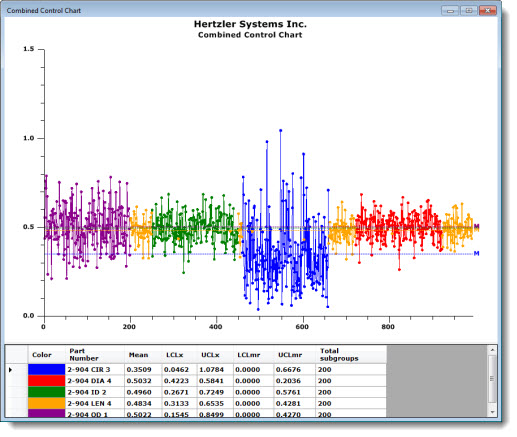
The Combined Control Chart enables comparison of the subgroup averages from multiple retrieval groups that share a similar combination of date/time stamp and/or traceability values. You can also configure GainSeeker to group similar date/time retrievals, compare specific traceability fields, or sort data by other traceability values.
GainSeeker vertically aligns subgroup averages from different retrieval groups that share the date/time stamp or traceability information you have specified.
|
Contents [Hide] |
If a data record does not match the displayed traceability values of a data record from a different retrieval group, it still displays on the Combined Control chart, as shown in the first three points on the following chart:
GainSeeker matches date/time stamps that are close to each other when it groups the data points for two or more standards. By default, date/time stamps within 10 seconds of each other are considered identical. See Matching and sorting data records in a Combined Control Chart for more information.
You can change the number of seconds GainSeeker uses to consider two date/time stamps identical.
See Allowable difference in seconds between two date/times to consider them identical = for information about changing this setting for specific charts.
The default setting GainSeeker uses for the allowable difference can be changed in the Administration module.
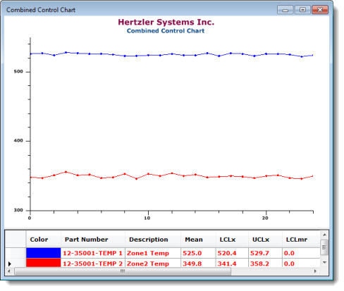
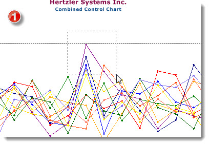
When the upper and lower limits for two or more retrievals combine on a Combined Control Chart resulting in a large spread between the upper and lower limits, the data may plot in a horizontal line that may appear misleadingly flat. In the following example, the combined Y-axis data ranges from 300 to more than 500, producing a wide variance that appears to flatten the detail for each retrieval. You can normalize the plot points based on the control, gate, specification, or individual limits.
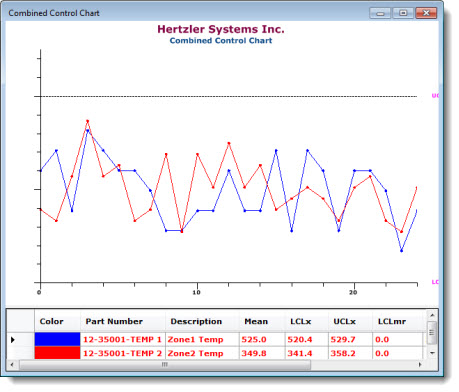
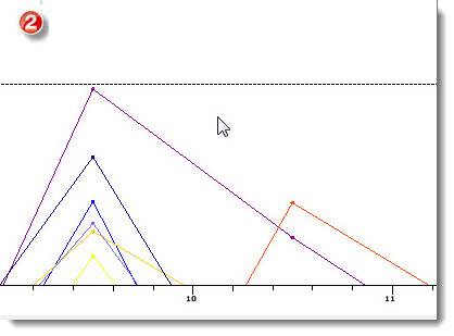
When the same data for the same retrievals is normalized (scaled), the individual data points for each appear more distinct, as shown in the following chart. Normalized scaling plots each data point in a retrieval group relative to the limits you select. All the data for each standard plots with the same accuracy relative to its limits.
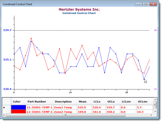
You can still display the Y-axis values for any of the retrievals. To do this, click and hold the mouse button on a data point.* The limits and mean for that retrieval display on the Y-axis until the mouse button is released. In the first example below, A data point for the 12-35001- TEMP 1 standard (in red) is clicked to display the limits (also in red) for that retrieval. In the second example, a data point for the 12-35001-TEMP 2 standard (in blue) is clicked, revealing the limits (also in blue) for that standard.
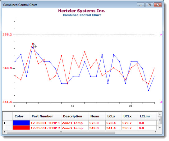
*The click feature is not available on non-normalized Combined Control Charts.
See Range/Sigma vertical (Y) axis based on and X-Bar vertical (Y) axis based on settings for Combined Charts for information about how to normalize the data.
To zoom in on one or more data points on a chart:
Click an area on the chart near the points on which you want to zoom. Then, drag the selection rectangle to include those points.
You can repeatedly brush the data to continue enlarging an area. Right-click to view the previous display. To return to the full chart view, continue to right-click.
To help distinguish each standard on the chart, GainSeeker assigns a color to each. The table under the chart features a color key to help you quickly identify a standard and the data associated with it:
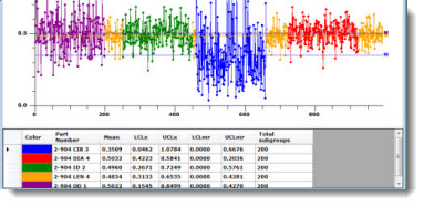
The colors are assigned to the standards in a revolving cycle in the order shown in the following table. For example, if your system has been set to use Medium Slate Blue as the color for the first standard, then Yellow, Dark Turquoise, Dark Red, and Lime would be used to denote the second, third, and fourth standards, respectively.
Color |
Example |
Blue |
|
Red |
|
Green |
|
Orange |
|
Dark Magenta |
|
Gold |
|
Navy |
|
Orange-Red |
|
Dark Green |
|
Tomato |
|
Medium Slate Blue |
|
Yellow |
|
Dark Turquoise |
|
Dark Red |
|
Lime |
|
Chocolate |
|
Fuchsia |
|
Olive |
The chart setting Chart overrides | Charts | Default reports | Statistics under combined control chart determines which statistics are displayed below the chart. For a chart that is already open, you can change this setting by right-clicking on the chart and then clicking Statistics Report.
This chart ignores the Show statistics list under chart setting and always displays statistics below the chart.