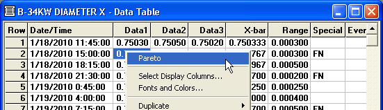
Creating a Pareto Chart from a Data Table
After creating a Data Table, you can create a Pareto chart of data records where bars are sorted by any traceability or corrective action field.
-
Right-click the data table and then click Pareto.
-
When prompted, choose the traceability or corrective action field to use for categorizing the data records on the data table:
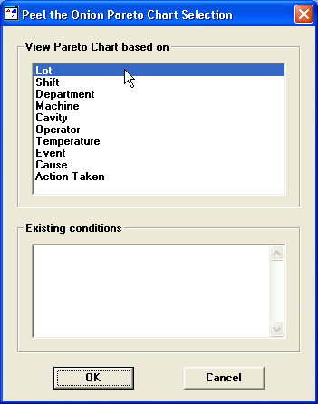
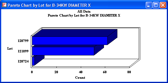
Then click OK. This will display a Pareto chart that is sorted by the traceability or corrective action field you selected:
Creating drill-down Pareto charts
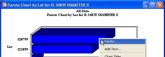
When a Pareto chart is displayed on your screen, you can drill into one of the bars on the chart to generate a Pareto chart of the data records associated with that bar of the chart:
-
Double-click the Pareto bar for the data that you want to chart. Alternately, you may right-click that Pareto bar and then click Pareto.
-
When prompted, choose the traceability or corrective action field to use for categorizing the data records from the Pareto bar you clicked
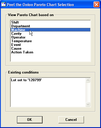
Then click OK. This will display a Pareto chart that is sorted by the traceability or corrective action field you selected:
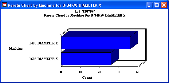
You will notice that the top line on this chart shows which Pareto bar you drilled into.
Changing display options on a drill-down Pareto chart
When a Pareto chart is displayed on your screen, you can set options such as whether bars are two-dimensional or three-dimensional and the maximum number of bars to display.
To set these options and more, right-click on the Pareto chart and then click Display Options. Alternately, choose Display Options from the Options menu.
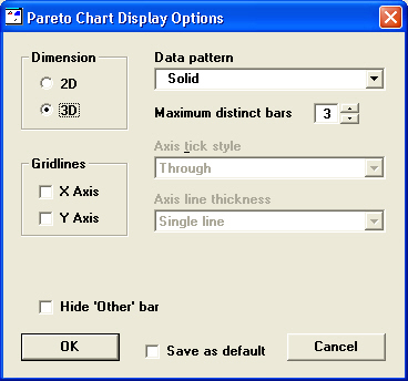
Dimension
You can choose whether to display the bars with a two-dimensional or three-dimensional appearance. Click on 2D or 3D to select the display you prefer.
Gridlines
You can choose to draw horizontal (X Axis) or vertical (Y Axis) lines on the chart.
Data pattern
Use this list to choose how bars will be filled with color. If you often print charts, you can minimize the ink used by choosing a patterned display instead of a Solid display.
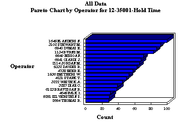
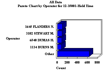
Maximum distinct bars
To focus attention on the bars with the highest counts, you can choose the maximum number of bars to show on your Pareto chart. If the data retrieved for the chart has data for more than the specified number of bars, this data will be combined into the last bar on the chart and titled "Other", as shown in the examples below.
To remove the limit on the number of bars displayed, set this option to 0.
|
|
|
|
|
Maximum distinct bars set to 0;
one bar is displayed for each item
|
|
Maximum distinct bars set to 5;
individual bars are shown for the top 4 items
|
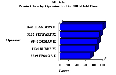
Hide 'Other' bar
When an "Other" bar is displayed because you have set the Maximum distinct bars, you can remove it from the chart by selecting the Hide 'Other' bar check box, as shown in the examples below:
|
|
|
|
|
Maximum distinct bars set to 5 and
Hide 'Other' bar check box cleared
|
|
Maximum distinct bars set to 5 and
Hide 'Other' bar check box selected
|
Save as default
To save your selections as the new default settings for this workstation, select the Save as default check box and then click OK.
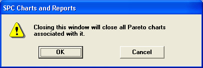
Closing the window on which Pareto charts are based
When you close a Data Table or a Pareto Chart, GainSeeker warns you that it will also close all Pareto Charts that were based on the window you are closing: