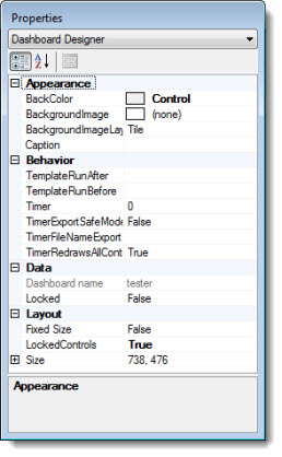
Using the Properties dialog, you can change the property settings for the dashboard window and any of the dashboard controls you place on the dashboard.
The Properties dialog opens any time you open a dashboard in design/edit mode.

When you open a dashboard in design/edit mode, the Properties dialog opens with Dashboard Designer preselected in the drop-down list. The properties that display in the properties grid are specific to the dashboard window when this is displayed.
If you click the name of a dashboard control in the drop-down list or click on the control itself, the properties for that dashboard control will display in the Properties dialog. Because each of the dashboard controls vary somewhat from each other, each will have a unique set of properties and property value options.
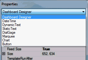
Any dashboard control that is assigned to a dashboard will list in the drop-down list of the Properties dialog. In the following example, the featured dashboard has seven controls associated with it. Clicking on a dashboard control name in this menu (the Button, for example) is one way to display the property settings specific to that control.
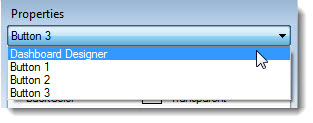
If you add two or more of the same type dashboard control to your dashboard window, they will display in the drop-down menu in the order in which they were added. For example, Button 1, Button 2, Button 3... .If any are deleted, they will renumber the next time you add another control of that type to the dashboard or the next time you open the dashboard.
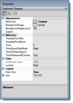
The properties options grid is divided into two columns. The left column contains property names that are specific to whichever control (or the dashboard itself) is selected for edit. The right column contains values and options for the properties listed adjacent to each.
The left side (column) of the properties grid contains properties—and any subproperties—that are arranged categorically in cells under main headings. The may change depending on the dashboard control you have selected.
To edit a dashboard or any controls associated with it, it must be the active component in the Properties dialog.
Click on the dashboard itself in design/edit mode to make it the active component or on one of the dashboard controls on a dashboard in design/edit more, or
Click the property name if it is visible or click the value cell adjacent to it in the right column
-or-
Click the ![]() symbol preceding a category (categories are in bold font) to expand it so it displays all of its properties. Then, click on the target property
symbol preceding a category (categories are in bold font) to expand it so it displays all of its properties. Then, click on the target property
-or-
Click the ![]() symbol preceding a property to expand it to display its subproperties. Then, click on the target subproperty.
symbol preceding a property to expand it to display its subproperties. Then, click on the target subproperty.
 Click the
 ![]() symbol preceding a category or property to collapse it so that none of its properties or subproperties show.
symbol preceding a category or property to collapse it so that none of its properties or subproperties show.
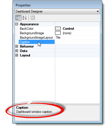
When you select a property by clicking in a cell on the left side of the properties grid, the description of it opens at the bottom of the Properties dialog to help you understand the property's function:
The right side (column) of the properties grid contains value cells that can be changed for the property located opposite it on the left side of the grid.
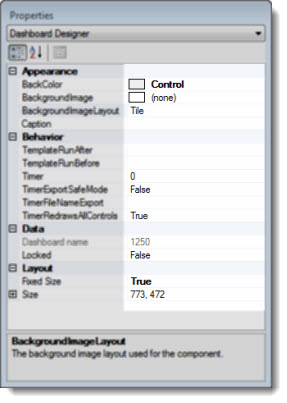
The value cells differ on how you are able to edit values for the properties to which they are linked. So, when you click in a value cell, it will only allow you to:
Enter alphanumeric characters
Select options from a drop-down window. (When you click in the value cell, a drop-down menu button appears.)
Make selections from or enter alphanumeric characters in a dialog. When you click in the value cell, an ellipsis button ![]() displays. When you click the button, a dialog opens.
displays. When you click the button, a dialog opens.
Choose values from a list of subproperties that appears when you click in the window
Change the value of a subproperty.
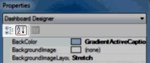
The Properties dialog toolbar has two buttons for sorting properties within the property grid. Switch between these two buttons to help locate specific properties using different methods.
|
Button |
Name |
Function |
|
|
Categorized |
Sorts properties alphabetically within their respective categories |
|
|
Alphabetical |
Sorts properties alphabetically—independent of their respective categories |
 The button on the far right on the toolbar is intentionally disabled since it is not needed with GainSeeker Suite. The button on the far right on the toolbar is intentionally disabled since it is not needed with GainSeeker Suite. |
||