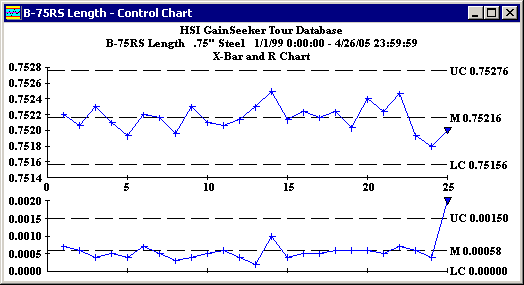
All processes exhibit variation. A Control Chart helps to distinguish between random variations and those due to a special cause. It is one of the most commonly used tools for basic process control.

The Control Chart can be displayed in different ways:
For subgrouped data, this is typically shown as an X-Bar and R Chart.
The top chart plots the subgroup averages (![]() ) and the bottom chart plots the range of each subgroup (R).
) and the bottom chart plots the range of each subgroup (R).
For individuals data (data with a subgroup size of 1), this is typically shown as an X and MR Chart.
The top chart plots the individual data points (X) and the bottom chart plots the "moving" range between previous data point and the current data point (MR).
For either subgrouped or individuals data, a sigma chart can be displayed as the bottom chart.
The type of chart displayed depends on the way the standard was configured. For more information, see Creating a new standard. The chart type also affects the way that Control Limits are calculated. For more information, see Calculating Control Limits.