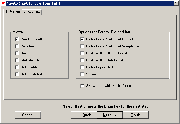
Pareto charts can present the same information in different graphic forms. You may also want to see the data supporting the charts as numerical values. The system also contains a list of statistics that can be calculated for your data and displayed simply as a statistics list. The Pareto, pie, and bar charts also give you six options for controlling how you want the data reported on the charts.

On the left are different ways to views the data. On the right are the options for how you would like the data to be reported on Pareto, pie and bar charts.
You can select multiple chart views and multiple options for displaying your data. Choosing more than one chart view at this point will save you the trouble of returning to this screen later.
For the following sample data set, each chart option will display the following results:
|
Sample data set |
||
|
Sample size: |
100 units |
$1.00 / unit |
|
Defective units: |
10 units |
see defect costs below |
|
Defects: |
5 dents |
repair cost of $0.10 / dent |
|
3 scratches |
repair cost of $0.01 / scratch |
|
|
2 misaligned |
repair cost of $0.05 / misalign |
|
|
Chart Options |
What is displayed |
|
Defects as % of total defects |
Displays the total number of defects Categorizes them by the type of Defect Management System Displays what percentage of the total number of defects each defect is. Example: In the sample of 100 units, 50% of the defects are dents, 30% are scratches, and 20% are misaligned. |
|
Defects as % of total sample size |
Displays what percentage of all the units examined have defects Categorizes those defects by type. Example: In the sample of 100 units, 5% of the sample are dents, 3% are scratches, and 2% are misaligned. |
|
Cost as a % of defect cost |
Displays the cost of each defect category as a percentage of the total cost from all defects. Example: If cost is based on the cost per unit, then the total defect cost is $10, and 50% of the cost is from dents, 30% from scratches, and 20% from misaligned. If the cost is based on the defect cost, then the total defect cost is $0.63, and 79% of the cost is from dents, 5% of the cost is from scratches, and 16% of the cost is from misaligned. |
|
Cost as a % of total cost |
Displays the cost of defects as a percentage of the total cost of the sample. Example: If cost is based on the cost per unit, then the total defect cost is $100, and 5% of the cost is from dents, 3% from scratches, and 2% from misaligned. |
|
Units |
Displays the number of units with defects, rather than the total number of defects on all the units. Example: If our product could have more than one defect per unit, then we might see 5 dents, 3 scratches and 2 misaligned, but we might have only 3 units with all of those defects. (Defects do not equal nonconforming units.) In that situation, the graph would show that there are 3 units with defects. |
|
Sigma |
An index of the parts per million defective. |
Show bars with no Defects
To display bars for items without defects, select this check box.
If you are sorting by Defect, the chart will display one bar for every defect that is assigned to the Processes being charted.
For example: if you are generating a Pareto chart for one process, and 10 defect reasons have been defined for this process, this Pareto chart will display 10 bars.
If you are sorting by a traceability field, Process, Part Number, or Event, the chart will display one bar for every item that was found in the data retrieval.
For example: if you are sorting by the Machine traceability field, and the data that was retrieved for this chart referenced three different machines, then the Pareto chart will display three bars.