 If
you have set options for
OEE retrievals for a configuration, the caption for the DMS
Charts dialog is OEE/DMS Charts.
If
you have set options for
OEE retrievals for a configuration, the caption for the DMS
Charts dialog is OEE/DMS Charts.The Retrieval/Configuration node on the Settings tab offers multiple options for temporarily overriding the GainSeeker default settings for how defect data statistics are calculated. Information about each of these settings is featured in this topic.
You can assign defaults to charts for some of these settings in the GainSeeker System Administration module. See Chart Defaults settings
|
Contents [Hide] |
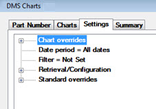
The Retrieval/Configuration node is located at the top level on the Settings tab
 If
you have set options for
OEE retrievals for a configuration, the caption for the DMS
Charts dialog is OEE/DMS Charts.
For help with using tree structures like the one on the Settings tab, see Navigating Tree Structures
This setting affects how GainSeeker calculates the statistics Total Sample Size, Total DPM, Total DPB, Total DPK, % Defects, % Good (not defects), and Total good Units.
When this check box is cleared (the most typical setting), these statistics are calculated relative to the total units inspected (sum of the sample sizes from all the data records in the current retrieval).
When this check box is selected, GainSeeker uses the Opportunities per Unit from each DMS standard, multiplied by the total sample size retrieved for each standard, to calculate these statistics relative to the total opportunities for error instead of the total units inspected. This is useful in situations where different parts have vastly different levels of complexity.
This setting lets you choose which type of OEE Calculation to display on the OEE Time Chart - Availability, Quality, Performance, or OEE.
Opt for the system to always regard data as a certain type (c, np, p, or u) or have the system automatically determine the data type.
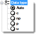
Change how the Y-axis on DMS control charts is scaled and labeled. The GainSeeker default setting is Percent.

DPM/PPM. Scales the Y-axis to Defects per-million (DPM) or Parts per-million (PPM), depending on the data type. This may be a good option if you have a small number of defects.
Percent. Scales the Y-axis from 1–100 and labels it Percent.
Proportion. Scales the Y-axis from 0.00–1.00 and labels it Proportion.
Configure options for calculating DPM (defects per-million) using these settings:.
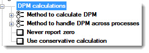
Method to calculate DPM
Modify the way defects per-million is calculated to better estimate when sample sizes are small.
For information about the Best estimate method, see Alternate methods of estimating DPM
For information about the Standard method, see Calculating DPU, DPMO, PPM, and related values

Method to handle DPM across processes
When you retrieve defect data across processes, you can calculate defects per-million using two different methods:
the Additive Method, or
the Averaged Method (the GainSeeker default setting).

Each of these methods can produce very different results in certain situations. The Average method is preferred by most customers, especially during start up, because it is less sensitive to new processes being added to the retrieval. The Average method is the GainSeeker default setting.
Never report zero
Use conservative calculation
Set a customized improvement goal for the DPU 10x charts. The default setting is 10 times improvement over two years. This value can be higher or lower depending on your situation.
Double-click DPU improvement goal = to open the Enter value dialog. Enter a numeric value representing the two-year time period goal.
Select the checkbox to exclude statistical outliers from all calculations. Include statistical outliers is the GainSeeker default setting.
This setting determines how multiple data records are grouped together into one plot point (or bar) on DPU charts.
The left-hand panel defines the primary category dividing data records into groups on a DPU chart. You can group data based on dates or times, Day/Shift (separate group for each combination of Day and Shift), or Traceability.
For example, you might set the primary grouping to Month - resulting in DPU charts like the examples below:
|
|
DPU line chart |
|
DPU bar chart |
If you check the Use second level grouping box, you can use the right-hand panel to sub-divide each of those primary bars by a secondary category. Some options may be disabled, depending on the primary grouping you selected in the left-hand panel.
For example, you might set the primary grouping to Month (like the example above) and the secondary grouping to Department:
|
|
When using second-level grouping:
A Legend is displayed for the colors of the secondary groups. You can drag this legend to another location on the chart window.
The chart will always be displayed with bars (not lines), regardless of the Display bars for DPU and DPU Yield charts setting, and data brushing is not available. The bars will always be displayed as two-dimensional bars, regardless of the Bars drawn in 3D setting.
The chart will not display Control limits, regardless of the DPU chart limits | Control setting.
This setting determines how multiple data records are grouped together into one plot point (or bar) on OEE charts.
In this example, the data on an OEE chart is grouped by Shift:
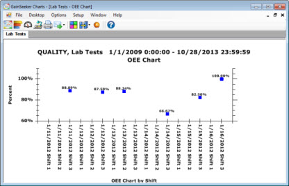
For the OEE Time Chart, this setting determines how OEE calculations are separated into date/time increments along the chart's x-axis, and how that data is separated into groups along the y-axis.
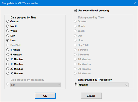
The setting for Data Grouped by Time determines how OEE calculations are separated into date/time increments along the chart's x-axis.
The setting for Data Grouped by Traceability determines how data is separated into groups along the y-axis. The chart can display up to 40 groups along the y-axis.
(The option to Use second level grouping is required and cannot be cleared.)
Change the number of decimals to display for cost values. The GainSeeker default setting is 2 decimals. Double-click Number of decimals for a cost value =, then enter a numeric value that represents the number of decimals to display.
Change the number of decimals to display for numeric values. The GainSeeker default setting is 2 decimals. Double-click Number of decimals for a number =, then enter a numeric value that represents the number of decimals to display.
Double-click the Selected Defects = option to open the Selected Defects dialog. This is where individual defects can be selected for the analysis. The GainSeeker default setting is to include all defects. See Select Defects dialog for usage information.
Select this checkbox to have GainSeeker automatically set the number of nonconforming units equal to the number of defects. Using this method, the data entry operator must only enter the sample size and the defect counts before storing each data record.
By default, GainSeeker tracks the number of nonconforming units separately from the number of defects. Using this method, the data entry operator must accurately enter the sample size, the defect counts, and the number of nonconforming units before storing each data record. This method also affects the analysis of DMS data records that are stored with a number of nonconforming units that is different from the number of defects.
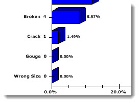
Select this checkbox to have GainSeeker display Pareto bars that have zero defects, as shown in the following example. The default GainSeeker setting is not to display these bars.
To set the precision for displaying time stamps, expand Show time to and select an option.

For information on changing the default setting, see Calendar and dates.
 Note:
Changing this setting will not affect Data Tables. To show a different
time precision on Data Tables, you must change the default setting.
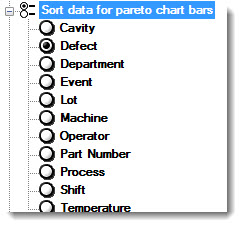
Select a traceability by which data is sorted for Pareto chart bars.
Choose how GainSeeker uses cost information.

The Defect list option uses individual defects costs.
The Standard list uses NCU (nonconforming unit) costs.
If you choose to have GainSeeker use cost information from a Traceability column, use the Use traceability column for cost information setting below to select which traceability to use.
Note: If multiple defect reasons are entered in one data record, the cost is split proportionately among defects. For example, if the cost is $10 and there are five defects (three broken and two blistered), the cost of each defect is assumed to be $2. The cost is not divided unevenly for defects with varying costs in one data record. For example, the cost of three defects (broken equals $3) and two defects (blistered equals $7). You can accomplish this by splitting the data into two data records.
Also see Cost from statistics and Assigning defects
Select which traceability column to use when you select the Traceability column option for the Use cost information from setting.