 Note: The Control data grid header items setting and all other settings located in the Chart overrides node of the Settings dialog can be saved as a chart skin that you can apply to any charts. For more information, see Chart Skins
The Control data grid header items option on the Settings tab lets you temporarily override default information to display on an optional grid above an SPC or DMS chart. The data grid header can display summary statistics for the chart, such as mean, and other information such as the date range for the retrieval.
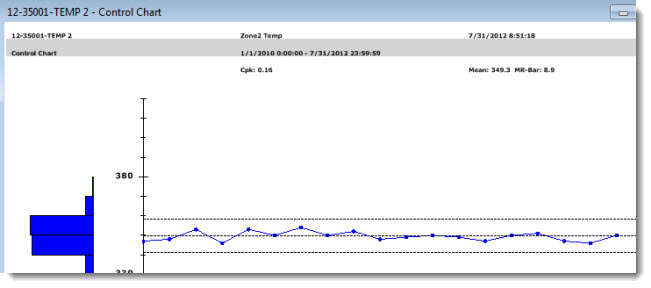
The grid header consists of up to four rows of information arranged in up to three columns. The following example shows a three-row, three-column grid above a Control chart.
 Note: The Control data grid header items setting and all other settings located in the Chart overrides node of the Settings dialog can be saved as a chart skin that you can apply to any charts. For more information, see Chart Skins
|
Contents [Hide] |
 For the data grid header to properly display, the Scroll data on the chart and the Show data grid on the chart options must be selected.
Chart overrides | Charts | Control chart options |
Then, expand the Control chart options node to display the Scroll data on the chart and the Show data grid on the chart options.
Click Scroll data on the chart and Show data grid on the chart to select these options:

 Note: When the Show data grid on the chart option is selected, GainSeeker automatically displays two grid types above a chart: the data grid header featured in this topic and a scrolling data grid option. For information on the scrolling grid option, see scrolling items on the chart
Navigate to the Control data grid header items option following this path on the SPC Settings tab or the DMS Settings tab:
Chart overrides | Charts | Default reports | Control data grid header items =

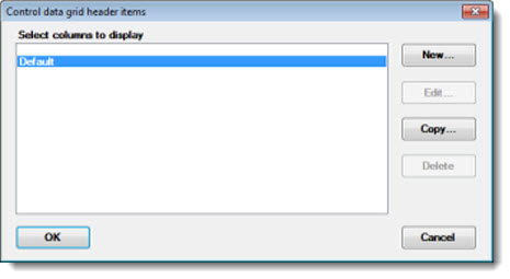
Double-click Control data grid header items = to open the Control data grid header items dialog.
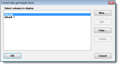
To add or change items on the grid header:
Click New... To create a new set of header items.
-or-
Click Copy... to copy the GainSeeker Default common header items so you can change the items to fit your needs.
The Enter value dialog opens. Enter a new name for the header items set in the Select columns to display box. Then, click OK.
The Control data grid header items - [new name here] dialog opens.
Like the actual grid that displays with the chart, the Control data grid header items dialog features four rows arranged in three columns. Each cell on the dialog represents the position where each label will display on the grid. Each column on the finished grid occupies one third of the available horizontal space on the chart window, so keep this in mind when you are deciding the number of statistic labels to add to a column cell. Three or less labels per cell is a good place to start.
To add or change the labels:
Double-click a grid cell in the dialog,
-or-
Click a grid cell and click the Edit... button.
A selected cell will highlight as in this example:
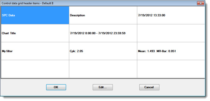
Each time you select a grid cell for edit, the Define Chart Title dialog opens. Use this dialog to select the statistic labels. See Using the Define Chart Title dialog for usage information.

For more information, see scrolling items on the chart
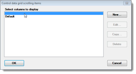
To display only the data grid header featured in this topic above a chart, the Control data grid scrolling items option must read: = Not Set, as in this example:

To turn off the Control data grid scrolling items feature:
The Control data grid scrolling items dialog opens.
