You can draw a Pareto chart using the data in an SPC Data Table in the GainSeeker Charts module. The Pareto chart gives you a comprehensive view of individual data records in the table. It is useful for seeing how your data records are distributed among various traceability categories.
You can also opt to drill down on the Pareto chart bars to get to the root causes of variation in your process so you can work to improve them.
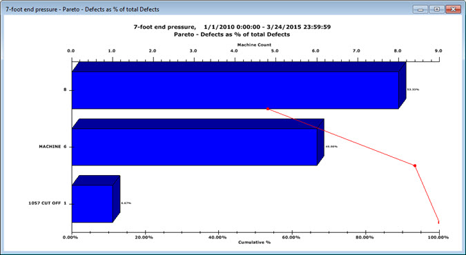
The Pareto chart that displays counts the number of data records containing each traceability value and then sorts those traceability values in order by the number of associated data records.
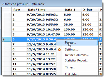
You can draw a Pareto chart from data records on the SPC Data Table.
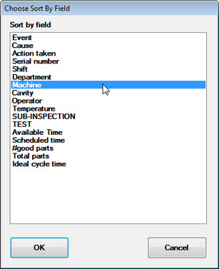
The Choose Sort By Field dialog displays.
A Pareto chart with data sorted for the selected field (Machine in this example) displays on the GainSeeker Charts window.
Because the Pareto chart that displays is like a DMS Pareto chart, it allows you to perform actions on the chart such as drilling down on a Pareto chart bar to get to the root cause and using the Drill-down wizard right-click option on the Pareto chart.
There are a few exceptions to how this Pareto chart differs from DMS Pareto charts. See Notes below in this topic for more information about these exceptions.
Each SPC data record is converted to a DMS data record with only one defect.
If you use the right-click menu Duplicate... option to draw another Data Table from the Pareto chart data, you will be unable to edit chart data or notes from that table. However, you can view these items.
The Pareto chart (and any charts you may duplicate from it) cannot be stored in a desktop.
If you plan to drill down on the Pareto chart by Cause or Action Taken, you must select it in the Choose Sort by Field dialog step before drawing the chart. These are not available as drill-down options.