Big Data Analytics DMS dashboard control
 The Big Data Analytics DMS dashboard control can display vast amounts of data. Organize the results using color to help you determine at a glance on which data to focus your efforts. You can also select a row in the grid and then use the DMS Drill-Down button to display a Pareto chart for that data. The chart is sorted by the Data sorted by value for that record. Then you can drill-down into the Pareto bars to see the root causes of defects.
GainSeeker also features a Big Data dashboard control for SPC analytics to help you uncover the sources of variation in your processes. See The Big Data Analytics SPC dashboard control
Note: This control cannot display data on a Slideshow.
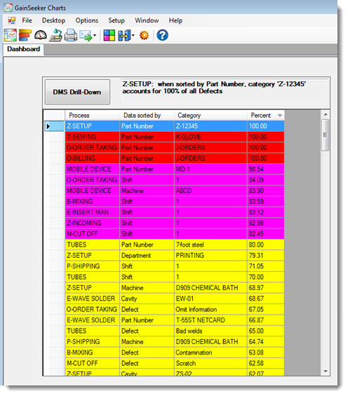
Following is an example of how this control might look on a dashboard window, depending on the retrieval, properties settings, and how you sort the results.
In the following example, the results are sorted by Percent. This is indicated by the down arrow ( ) in the Percent column. You can quickly re-sort the items by clicking on any of the column headers.

Adding a Big Data DMS control to a dashboard window
- Click the Big Data Analytics DMS control button on the dashboard controls toolbar. The toolbar only displays when the dashboard is in design/edit mode

The control opens on the dashboard in design mode. The Properties panel displays properties specific to this control.

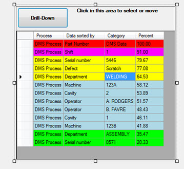
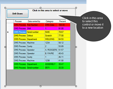
Selecting or moving the control
You can move the control to a new location or resize it when the dashboard is in design/edit mode.
When the control is selected, the Properties panel displays properties specific to this control. Use the perimeter handles to resize the control. You can also select the control by clicking in the grid region.

Using color to designate data ranges
The Big Data Analytics DMS control uses the Define Color Regions dialog to set a specific color for data records that fall within specific limits you specify. Setting colors helps you quickly identify data range groups at a glance.
The DMS Drill-Down button
Use the DMS Drill-Down button on the Big Data Analytics control to draw a Pareto chart using the data row you select. The chart displays the Data sorted by value for the row you select.
Example
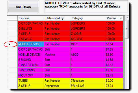
The selected row on the control in this example displays an arrow in the far left column of the grid (Fig. 1). The Data sorted by value for this row is Part Number. (Notice that the description for the selected row in the grid displays adjacent to the DMS Drill-Down button.)
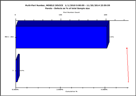
When the DMS Drill-Down button is clicked, the Pareto chart displays the percent of defects by the value in the Data sorted by column, in this example is sorted by Part Number (Fig. 2). Then you can drill down into the Pareto chart bar to pinpoint the root causes of defects.
Fig. 1
Fig. 2 
Displaying other chart types
You can display other chart types with the data for a selected grid item using the right-click menu Charts... option. The charts you draw using this method are grouped by the percentage of defects. For more information about right-click menu options, see Using the right-click menus for dashboard controls
Canceling a retrieval
When a retrieval for the dashboard control is completed, the control displays a DMS Drill-Down button label. However, while the control is retrieving data, the label for this button is Cancel. You have the option to cancel the retrieval using this button. You might choose to do this if the retrieval is taking too long, for example.
Right-click menu options for dashboard controls
Big Data properties you can set
Big Data dashboard control for SPC analytics
 The Big Data Analytics DMS dashboard control can display vast amounts of data. Organize the results using color to help you determine at a glance on which data to focus your efforts. You can also select a row in the grid and then use the DMS Drill-Down button to display a Pareto chart for that data. The chart is sorted by the Data sorted by value for that record. Then you can drill-down into the Pareto bars to see the root causes of defects.
  ) in the