Big Data Analytics SPC dashboard control
 The Big Data Analytics SPC dashboard control helps you pinpoint sources of variation among vast amounts of SPC data so you know where to focus your efforts. It is offers similar functionality to the GainSeeker Variation Wizard, but the Big Data control can analyze numerous part numbers and large amounts of data at once. You can use color assignment to group and sort the analysis. You may want to become familiar with the traceability relationships for your system to help you make informed decisions from the results this control displays.
Note: This control cannot display data on a Slideshow.
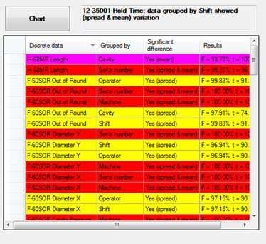
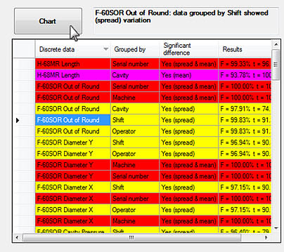
This is what this control might look like on a dashboard window depending on your data and property settings. You can select a row of data in the grid and draw a chart using that data. Color indicators you assign to specific data ranges provide quick recognition about your data.
When data for the retrieval first displays, it is sorted by the Results column. GainSeeker ranks the Results column by adding the F-test and t-test percentages together for each row. The sum results display in descending order in the grid.
In this example, the list items are sorted by Discrete data. This is indicated by the down arrow ( ) in the Discrete Data column. You can re-sort the items by clicking on any of the column headers and then draw a chart of any grid row you select. The chart data is grouped by the Grouped by column value for that row.

Adding a Big Data SPC control to a dashboard window
- Click the Big Data Analytics SPC control button on the dashboard controls toolbar. The toolbar only displays when the dashboard is in design/edit mode

The control opens on the dashboard in design mode. The Properties panel displays properties specific to this control.

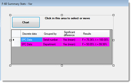
Selecting or moving the control
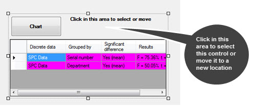
You can move the control to a new location or resize it when the dashboard is in design/edit mode. Use the perimeter handles to resize the control.
When the control is selected, the Properties panel displays properties specific to this control. You can also select the control by clicking in the grid region.

Using color to designate data results
The Big Data Analytics SPC control uses the Define Color Regions dialog to set a specific color for data that falls within limits you specify. Setting colors helps you quickly identify data where to focus your effort.
Differentiating between continuous and discrete data
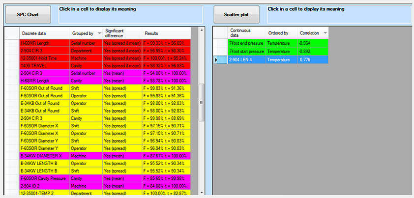
The Big Data Analytics SPC control can analyze both Discrete and Continuous data values as shown in the following image in which Discrete data is displayed in the left grid and Continuous data in the right grid. There are a few property setting conditions about which you should be aware when you analyze either or both data types on this dashboard control. See Analyzing discrete and continuous data or more information.

Using the SPC Chart button or Scatter Plot chart button
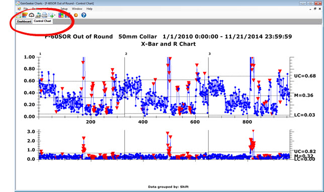
On a running dashboard, you can draw a chart for the selected record in the grid by clicking the SPC Chart button (for Discrete data). This displays a Control chart on which data is grouped by the Grouped by column value for that record and by any filter you have set for the retrieval. In the following example, when the button is clicked with the F-60SOR Out of Round standard record selected (Fig. 1), the chart data will be grouped by Shift (Fig. 2)—the value in the Grouped by column for that record.
(Note: For Continuous data, this displays a Scatter Plot chart and the control displays a Scatter Plot chart button.)
This displays a Control chart on which data is grouped by the Grouped by column value for that record and any filter you have set for the retrieval. In the following example, when the button is clicked with the F-60SOR Out of Round standard record selected (Fig. 1), the chart data will be grouped by Shift (Fig. 2)—the value in the Grouped by column for that record.
(Also notice that the interpretation for the selected row, F-60SOP Out of Round in this example, displays adjacent to the Drill-down button.)
You can switch between any open charts and the dashboard by clicking the window tabs (circled area in Fig. 2).
Fig. 1 
Fig. 2
Displaying other chart types
You can display other SPC chart types with the data for a selected grid item using the right-click menu Charts... option. The charts you draw using this method are grouped by the Group by column value (for discrete data) for that row in the grid. If the data has a filter, it is filtered by the Data filtered by value and then grouped by the Grouped by column value.
For information about other right-click options, see Using the right-click menus for dashboard controls
Canceling a retrieval
When a retrieval for the dashboard control is completed, the control displays an SPC Chart button. However, while the control is retrieving data, the label for this button is Cancel. You have the option to cancel the retrieval using this button. You might choose to do this if the retrieval is taking too long, for example.
Viewing select continuous and discrete data as a chart or in a data table
Big Data properties you can set
You can set multiple properties to customize the Big Data dashboard control, including color regions.
The Big Data dashboard control for DMS analytics
 The Big Data Analytics SPC dashboard control helps you pinpoint sources of variation among vast amounts of SPC data so you know where to focus your efforts. It is offers similar functionality to the GainSeeker Variation Wizard, but the Big Data control can analyze numerous part numbers and large amounts of data at once. You can use color assignment to group and sort the analysis. You may want to become familiar with the traceability relationships for your system to help you make informed decisions from the results this control displays.
 ) in the