![]() The Marquee dashboard control can be set to stand out from the rest on the dashboard window using scrolling text, color, and other eye-catching effects that spotlight key information at a glance.
The Marquee dashboard control can be set to stand out from the rest on the dashboard window using scrolling text, color, and other eye-catching effects that spotlight key information at a glance.
This example of a Marquee dashboard control has a variety of special effects that you can set, including scrolling text and "flashing" the text with a strobe effect.

This control can be automatically refreshed to display the latest data at a time interval you select or it can refresh along with the dashboard window
Some of the Marquee control properties (attributes) may be familiar in usage and may not usually require additional explanation. The properties specifically designed for GainSeeker users are featured in this topic.
See Using the Properties dialog

The Dashboard Control Retrieval dialog opens.
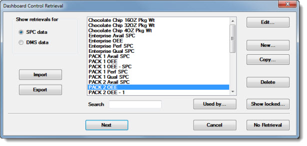
Click the name of a preexisting retrieval to select it or click New... to create a retrieval. See Using the Dashboard Control Retrieval dialog for more information on the dialog options, including importing, exporting, editing, creating, and copying retrievals.
|
|
Click Next or OK on the Dashboard Control Retrieval dialog after a retrieval is selected.
The Pick Marquee Skin dialog opens:
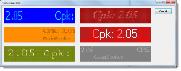
Click a Marquee skin (design) option. Each of the options have somewhat different Behavior and Appearance properties, which can later be customized using the Properties dialog box. See editing the Marquee control
The Set label Text dialog opens. Select the statistics to display on the control and any user-added text. Then, click OK. See Using the Set Label Text dialog

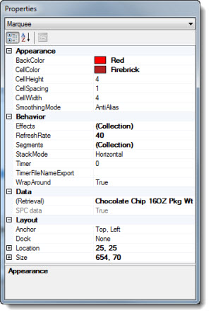
The control opens on the host dashboard in design/edit mode, displaying the selected statistic labels. The Properties dialog menu displays the Marquee setting and the properties grid displays the properties specific to this control for which the property values can be changed.

When the control is saved in design/edit mode and opened on its host dashboard window in run mode, it may look similar to this example depending on the skin and the Effects properties assigned to it.

Click the Marquee control to select it on the host dashboard window that is open in design/edit mode.
The Properties dialog box drop-down list displays the Marquee setting and the properties grid displays the property values specific to that control.
To change the (Retrieval) property setting in the Properties dialog:
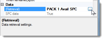
The Dashboard Control Retrieval dialog opens. See Using the Dashboard Control Retrieval dialog
The Effects property value under Behavior on the Properties dialog is where visual effects for the text such as scroll direction and fade effect are set for the Marquee control.
To edit the Effects property value:
The Define Marquee Effects dialog opens.
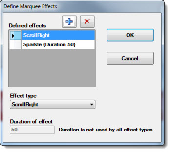
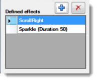
The Define Marquee Effects dialog opens with the default Effects associated with the selected Marquee skin are listed in the Defined effects list:
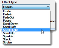
The Effect type drop-down list on the dialog has several display options.
To add a new Effect to the Marquee:
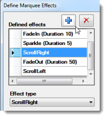
Effects that have changeable duration rates show the word "Duration" along with a numeric value in parenthesis after the Effect name in the list. The number denotes the length of time the Effect activates for each display cycle.
To change the display duration of an Effect:
Click the Effect in the list to select it.
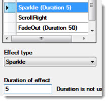
(The higher the number, the longer the duration rate. A duration value of 33 is equivalent to about 1 second on most computers.)
Select the numeric value in the text field and enter a new numeric value.
Click OK after the wanted Effects are set on the dialog.
|
|
The RefreshRate property value determines the speed at which the Marquee cycles through its assigned Effects.
To edit the RefreshRate property on the Properties dialog:
Click the RefreshRate property value cell on the Properties dialog

|
|
Define text label segments so that each may be separately formatted using the Segments property value.
To change the Segments settings:
![]()
The Define Marquee Segments dialog opens.
Existing statistics labels and any user-defined text lists in the Defined segments area on the Define Marquee Segments dialog.
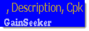
The Marquee in this example has two defined segments—the statistics labels (Description, Cpk: . . . etc.) and the GainSeeker text label.

Since the text segments on this Marquis are separately defined in the Defined segments area of the dialog, each can be changed to display different formatting properties like font type, size, and color as in this example. See Editing the StackMode property for information about stacking segments vertically (such as in this example) or displaying them horizontally within the same line:
To edit a segment:
Click a segment in the Define Marquee Segments area of the Define Marquee Segments dialog to select it for edit (the "GainSeeker" segment in this example).

Click a defined text segment in the Defined segments list.
Click the Text property value cell in the properties grid of the Define Marquee Segments dialog to select it. Then, click the ellipsis button![]() in the value cell.
in the value cell.
![]()
The Set Label Text dialog box opens. See Using the Set Label Text dialog
Make changes as needed to the statistics text field on the Set label Text dialog box. Then, click OK.
The selected segment show in the Define segments list of the Define Marquee Segments dialog.
Click OK on the Define Marquee Segments dialog after all changes have been made to any segments.
|
|
A control can display multiple defined segments with the format for each set somewhat different from the others.
To add a new defined segment:
Click a segment in the Defined segments list. Then, click the add button![]() on the Define Marquee Segments dialog.
on the Define Marquee Segments dialog.
A blank segment line will add to the Defined segments list. For information on adding statistics and text labels to the segment, see Editing the statistics and user-defined text label
To delete a defined segment:
Click a segment in the Defined segments list. Then, click the delete button![]() on the Define Marquee Segments dialog.
on the Define Marquee Segments dialog.
Also see Editing the StackMode property value
You can edit the Appearance Cell properties for CellColor, CellHeight, CellSpacing, and CellWidth on the Properties dialog box set for the Marquee control.
This Marquee skin option is set by default with the CellColor the same as the BackColor, so that the cells are not apparent.

The cells are apparent when the CellColor property is changed to a color that contrasts (in this example, Light Steel Blue) in relation to the BackColor:
.
To edit the CellColor property:
Click the ellipsis button![]() in the CellColor property value cell to view the drop-down list of cell color options. Then, click a color to select it.
in the CellColor property value cell to view the drop-down list of cell color options. Then, click a color to select it.
To edit the CellHeight, CellSpacing, and CellWidth properties on the Properties dialog box:
Click the property value cell on the Properties dialog. Then, delete the existing numeric value. Then, enter a new value.
CellHeight—sets the height of each cell
CellWidth—sets the width of each cell
CellSpacing—sets the number of pixels between cells
Also see Editing the CellColor property
Use the StackMode property to set the defined label segments to stack horizontally (on the same horizontal line) or vertically (as in this example where the two segments—differentiated by color, type, and size of font settings—are shown in Vertical or "stacked" mode):

To switch between Horizontal and Vertical modes:
The label text display on a Marquee is set by default to appear as if it "wraps around" the Marquee—feeding in through one side, feeding out through the other, and then repeating this pattern (with ScrollRight and ScrollLeft Effects assigned to the control*).
Click True in the drop-down list in the WrapAround property value cell on the Properties dialog to set the Marquee to display the label text in "wrap-around" appearance mode.
Click False in the drop-down list in the WrapAround property value cell on the Properties dialog to set the Marquee so that it does not display label text in "wrap around" appearance mode.
*With ScrollDown or ScrollUp Effects assigned to the control, the label text display appears to feed in through the top or bottom, depending on the setting, and feed out through the opposite vertical perimeter.
For information about editing some of the other Marquee properties, see:
Timer property
TimerFileNameExport property
Design Data property
Z Order property