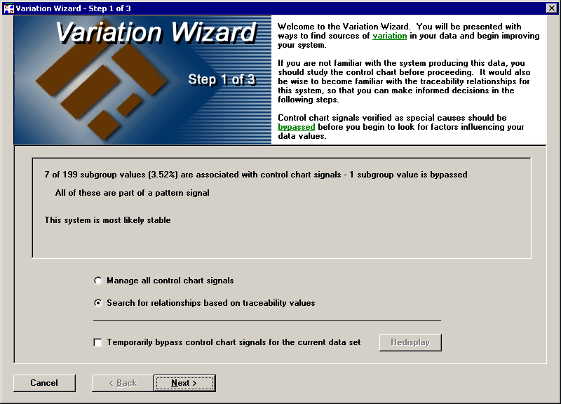
The first step of the Variation Wizard presents two choices. The first choice is to manage your control chart signals. This option takes you to the Control Chart Signals dialog. If you are ready to examine underlying relationships between your data and traceability, you can choose the second option, to search for relationships.

You can choose to temporarily bypass all current control chart signals. If you refresh your chart or make any changes to data or notes, the temporary bypass status is lost. Click the Redisplay button to update your chart and the control chart signal information on this step.
The second step of the Variation Wizard allows you to choose which traceability values are used in the analysis, the minimum number of items required before a group is included in the analysis, and the number of levels to analyze. This topic will follow through with a level one analysis, but you may also want to see an example for a Level Two Analysis to understand when this may be useful.
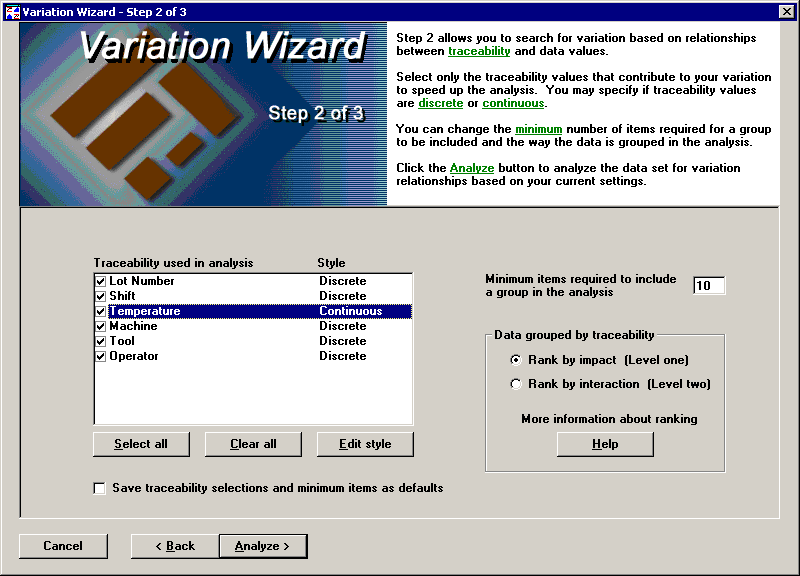
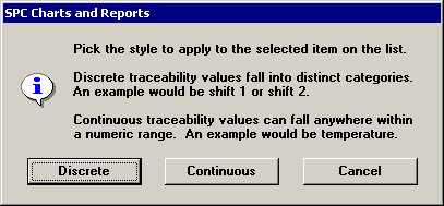
You can choose for each traceability item whether its style is discrete or continuous.
Discrete traceability values can be sorted into categories. All traceability fields containing alphabetical characters are discrete.
Continuous traceability values are numbers. They are often used to track environmental or ambient variables - such as temperature, pressure, or current staffing levels - that are measured along with the characteristics of your products. The Variation Wizard can help you to determine whether there is correlation between these environmental variables and the measured characteristics of your products or services.
To see the analysis results for all of the selected traceability, click the Analyze button.
The third step of the Variation Wizard shows the analysis results and allows you to draw charts to view the variation between groups.
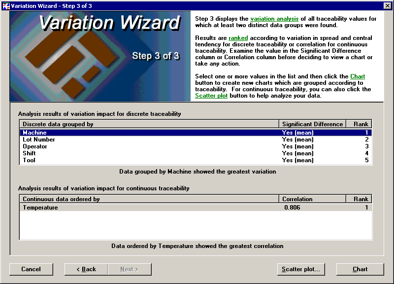
If you have discrete traceability, you will have a list like the one on top where the traceability is ranked and the significance of variation between groups is based on F-Test and t-test results. The F-Test checks to see if the spread of two groups are significantly different, and the t-Test checks if the means of two groups are significantly different. You should start with the highest-ranked item in the list and look at the chart by the selected traceability. You may quickly decide that although the variation is significant, the differences between groups are not large enough to make any changes. See the following chart for Machine, which was the highest ranked item above.
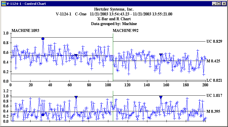
In this case, you may not want to tamper with this process because the difference between means of the two groups is small compared to the spread of either group.
If you have continuous traceability, you will have a list like the one on the bottom, where the traceability is ranked according to the correlation coefficient. In most cases it is very useful to see a scatter chart of your data to see how much your traceability changes affect your data values. The closer that the correlation coefficient gets to one or negative one, the greater the significance of variability for that traceability becomes. If the correlation coefficient is zero, there is no significance at all. The following scatter chart shows traceability with a correlation coefficient of .806:
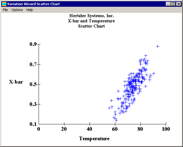
With a scatter chart, it is easy to see that the X-bar values rise dramatically as the temperature increases.