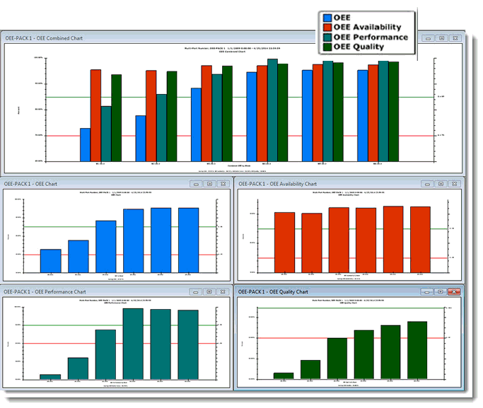
OEE (Overall Equipment Effectiveness) charts are similar to DPU charts in that they use percentages to group data by a time period such as shift, hour, day, or week. The OEE chart displays the overall OEE percentage that is calculated using percentage data from each of these metrics: Availability, Performance, and Quality.
All four charts can be stored on a retrievable desktop. Chart Overrides display settings on the Settings tab have been applied to the OEE charts on this desktop example:
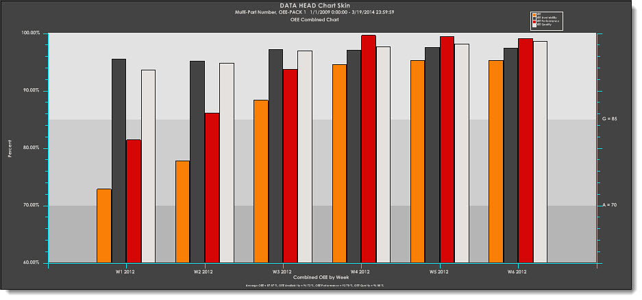
OEE Combined charts display percentage data for Availability, Performance, Quality, and overall OEE. The data is grouped and plotted by a selected time period at a single data point at successive time intervals. The chart uses different color and data marker shapes for each of these statistics. A Chart skin has been applied to this OEE Combined chart.
 Note: You must perform a few simple tasks before GainSeeker can properly retrieve OEE data. See OEE Retrieval Prerequisites for details.