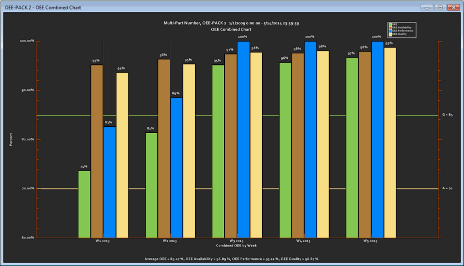
OEE (Overall Equipment Effectiveness) Combined charts display percentage data for Availability, Performance, Quality, and overall OEE. The data is grouped and plotted by a selected time period at a single data point at successive time intervals. The OEE Combined chart uses a different color for each of these statistics and different data marker shapes.
A color key and markers legend is displayed within the chart to help you quickly identify the data corresponding to each metric.
|
Contents [Hide] |
This example of an OEE Combined Chart has a display Chart Skin applied.

You may want to display charts for all of the OEE metrics together on the GainSeeker Charts window. You can y set a unique color for each metric to easily identify each chart. These colors also carry over to the OEE Combined chart for that session. The colors can be set as defaults in the GainSeeker Systems Administration module.
For more information, see Using colors for OEE Data
GainSeeker assigns a succession of colors to help distinguish data on an OEE Combined chart. The colors help you quickly identify each of the four OEE statistics: Availability, Performance, Quality, and the overall OEE.
GainSeeker makes it easy to distinguish the data by assigning a unique marker shape and color for each statistic. These can be temporarily changed on charts or the default settings can be changed in the GainSeeker System Administration module.
The GainSeeker default marker shapes are:
Quality: Upward pointing triangle
Availability: Circle
Performance: Diamond
OEE: square

Note: If the legend visually conflicts with another other chart element, you can move the legend by clicking on it and dragging it to another position on the chart.