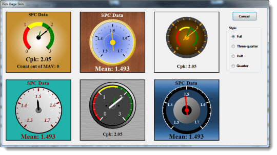
![]() Choose one of six ready-to-use skins to monitor key process indicators along with multiple statistics and user-selected text on a gage. Optionally use color recognition to define acceptable, unacceptable, and cautionary data zones on the gage.
Choose one of six ready-to-use skins to monitor key process indicators along with multiple statistics and user-selected text on a gage. Optionally use color recognition to define acceptable, unacceptable, and cautionary data zones on the gage.
This control can automatically refresh at a time interval you define or it can refresh along with the dashboard window.
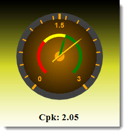
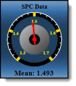
This is an example of how a Dial Gage dashboard control might look on a running dashboard, depending on the skin that is selected and the user-assigned properties:
|
Contents [Hide] |
Some of the Dial Gage control properties (attributes) may be familiar in usage and not require additional explanation. The properties that may have been specifically designed for GainSeeker users are featured in this topic.
Click the Dial Gage button on the dashboard controls toolbar on a dashboard window that is open in design/edit mode.

The Dashboard Control Retrieval dialog opens. See Using the Dashboard Control Retrieval dialog
Click OK or Next after a retrieval is selected on the Dashboard Control Retrieval dialog.
The Pick Gage Skin dialog opens.
The Initial Gage Information dialog opens. See Using the Initial Gage Information dialog
The Initial Gage Information dialog is where the statistics or values are set for a gage control. For information on selecting statistics, see SPC statistics available
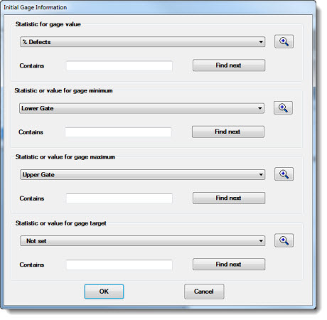
There are four categories for which to set a statistic or value using this dialog:
gage value indicator—Select the data to which the value indicator ("arrow") will point on the gage.
gage minimum value—Select a statistic (Lower Gate, for example) or User-defined number from the list. Then, enter a numeric value in the Number text field that displays when this option is selected.
gage maximum value—Select a statistic (Upper Gate, for example) or User-defined number from the list. Then, enter a numeric value in the Number text field that displays when this option is selected.
gage target indicator—Select an ideal or goal value on the gage to which the pointer will fix. Value options include statistics, User-defined numbers, or Not set.
Note: The drop-down list for each category will vary depending on whether DMS data or SPC data was selected for the control.
Click OK on the Initial Gage Information dialog after making selections.
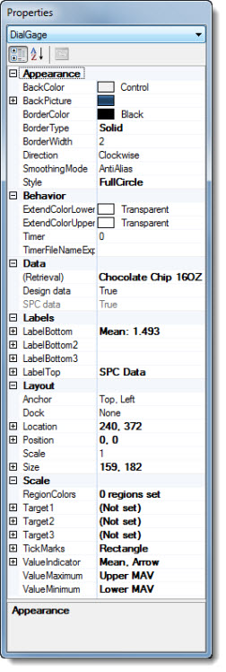
The Dial Gage control opens on the host dashboard window in design/edit mode. The Properties dialog menu changes to display the DialGage setting and the properties grid displays the properties specific to this control.
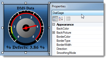
You can add an image or a color theme to the background of the control. This determines the appearance of the boxed area surrounding the gage.
 preceding the BackPicture property to display the Image and Index options.
Then:
To add a background image: click the Image property cell. Then, click the ellipsis button in the property value cell to select an image to from the Open dialog that opens
-or-
To select a background color theme from a list: click the Index property.

Note: If you have an Image and an Index value selected to display in the background, only the selected Image displays.
To remove an Image: click the property value: System.Drawing.Bitmap, and then press DELETE.
To remove an Index: click the property value and then press DELETE, or you can click the property value and then select the [none] option in the list.
Use the Direction property in the Appearance category of the Properties dialog to set the direction for increasing values on a gage.
Choose between Clockwise (the default setting) or CounterClockwise.
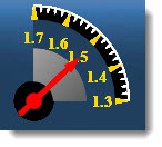
A good use for the CounterClockwise setting is when the DialGage Style property is set to a QuarterCircle as in this example where numbers increase from right to left:
Use the Style property in the Appearance category of the Properties dialog to change the circular portion of the gage.
Shown below are examples of FullCircle,ThreeQuarterCircle, HalfCircle, and QuarterCircle property value options from which to choose:
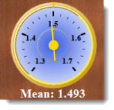
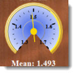
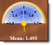
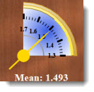
A good reason for changing the style property can be to allow room for more labels (see the Labels properties). Depending on the style, the Direction of increasing values might be taken into consideration. Also see Editing the TickMarks properties.
Note: If you change the Style property to a setting other than FullCircle or ThreeQuarterCircle, update the Position and Scale properties to best fit the newly selected style.
Note: Another option is to choose the circle style when the Pick Gage Skin dialog opens after a new Dial Gage control is added to a dashboard window (see adding a Dial Gage control to a dashboard window). Picking the circle style from the Pick Gage Skin dialog can produce better visual display results.
However, if you have already designed a Dial Gage on which you want to change the shape, create a new Dial Gage of the desired style. Then, apply the property value settings of the existing one to the new gage.
Use the ExtendColorLower property in the Behavior category to set a color that easily identifies data that extends below the set minimum (or starting) value on the gage. (See ValueMinimum for information on setting the minimum value.)
|
|
In this example, maroon was selected as the ExtendColorLower value color—a visual flag that the yield has fallen below the minimum starting value—17.

The ExtendColorLower value could also be set to display the same color as the region succeeding it (red in the above example), particularly if data less than the set minimum does not need to be distinguished from the succeeding region.
To set colors for defined regions (green, yellow, and red in the above example), see using the RegionColors property.
See ExtendColorUpper to set a color as a flag to data that extends beyond the maximum (or ending) value on the gage.
See setting the ValueMinimum and ValueMaximum properties.
Use the ExtendColorUpper property in the Behavior category to set a color that identifies data that extends above the ending (or maximum) value set for the gage. (See ValueMaximum for information on setting the maximum value for the gage.)
|
|
In this example, purple was selected as the ExtendColorUpper value color—a visual flag that the percent of defects has exceeded the maximum ending value on the gage—3.
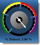
The ExtendColorUpper value could also be set to display the same color as the defined region preceding it (red in the above example), particularly if data that exceeds the set ending value is considered within the normal range.
Alternately, if this gage had been set to display yield statistics instead of defects, the ExtendColorUpper value (and possibly the defined region preceding it) might have been set to green.
To set colors for defined regions (green, yellow, and red in the above example). See using the RegionColors property.
See ExtendColorLower to set a color that easily identifies data that extends below the minimum (or starting) value on the gage.
See setting the ValueMinimum and ValueMaximum properties.
See Using the TimerFilenameExport property
To change the (Retrieval) property setting in the Data category:
Click the ellipsis button in the value cell.
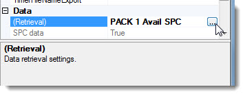
The Dashboard Control Retrieval Dialog opens. See Using the Dashboard Control Retrieval dialog
Use the Labels property to display up to four labels with multiple statistics and user-added text on the control. In this example of the Labels property, the LabelBottom subproperty list has been expanded. The subproperties are the same for LabelBottom2, LabelBottom3, and LabelTop.
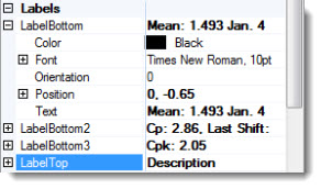
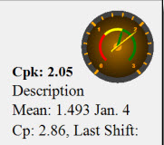
This example of a Dial Gage control has four labels containing multiple statistics and user-added text. To allow room for four labels, the gage has also been resized and repositioned on the control using the Scale property and Position property respectively.
Set the X and Y (horizontal and vertical) position of a label on a Dial Gage control using the Position subproperty under each label name.
Enter a positive or negative value in the value cell to change the label location.
To add statistics and static text to a label:
Click the ellipsis button in the value cell.
The Set Label Text dialog opens. See Using the Set Label Text dialog
Use the Position property in the Layout category in the Properties dialog to change the position of the gage on the Dial Gage control.

Change the X and Y (horizontal and vertical) position of the gage on the control by entering a positive or negative value in the X and Y value cells. X set at 0 and Y set at 0 centers the gage on the control.
Moving the position of the gage can provide extra space for labels as in this example:

To change the size of the gage on the control, see Scale
For information on adding statistic and static text labels, see Editing the Labels properties
Use the Scale subproperty under Position in the Layout category to resize the gage on the control. Sizing the gage smaller allows for more statistic labels on the control. For information on adding labels, see Editing the Labels properties. See Position for information on changing the position of the gage on the control.
Enter a numerical value in the Scale property value cell to set the gage size.
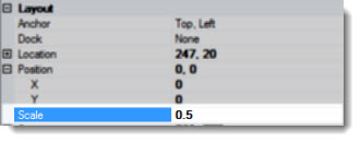
Following is a gage at the default setting of .85 and scaled larger to 1.00:
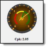
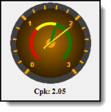
Use the RegionsColors property in the Scale category of the Properties dialog to define and flag acceptable, unacceptable, and cautionary data regions using colors.

In this example of a Dial Gage, red, yellow, and green data regions have been defined:

To define region colors:
Click the ellipsis button in the RegionColors property value cell.
The Define Gage Region Colors dialog opens.
See Using the Define Gage Region Colors dialog
Use the Target1, Target2, and Target3 properties in the Scale category of the Properties dialog to add up to three fixed target indicators to a gage.
A common use of a fixed target indicator is to point it to an ideal data point such as in the following example, in which the target indicator (white pointer) is fixed at the Cpk 1.67 point. Additional related target indicators could be added to the gage such as one fixed at the ideal Cp point and another fixed at the ideal Cr point.
The value indicator (the yellow pointer in the example) points to actual data, making for easy visual comparison when used with a target indicator. See Setting the ValueIndicator for information.

The Target1 property in the following example has been expanded to display subproperties. The subproperties for Target1, Target2, and Target3 are identical in use.
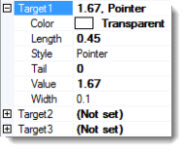
Note: When adding a new Target to a gage, the Value subproperty for that Target must be set before other subproperties can be set.
The Value subproperty
The Value subproperty under the Target properties fixes the location of the target indicator on the gage. Use the Value subproperty under the Target1, Target2, and Target3 properties to set the value to which the target indicator will point.
Click the Value subproperty value cell in the grid.
Click the ellipsis button.
The Pick a Statistic or Number Value dialog opens. See Using the Pick a Statistic or Number Value dialog to pick a statistic, set a User-defined number, or to leave it Not set.
Also see, Setting Maximum, Minimum, and Target values for a Dial Gage
Use the TickMarks property in the Scale category of the Properties dialog to determine the placement and attributes of the tick marks.
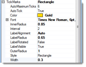
The TickMarks subproperties in the Properties dialog below, followed by a gage with tick marks and their respective numerals diagrammed in gold.
True
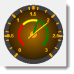
The AutoTick property value set to True is used in conjunction with the AutoMaximumTicks property—the maximum number of tick marks allowed for the gage. GainSeeker automatically calculates a practical interval rate and tick mark count for a gage based on the maximum tick marks allowed and the ValueMinimum and ValueMaximum settings for the gage when the AutoTick property value is set to True.
In this example, the AutoTick value has been set to True and the AutomaximumTicks property has been user-set to allow 12 or less tick marks. GainSeeker configures the best interval rate and the number of tick marks for the gage based on these property settings and the current retrieval range of 0–3 in this example.
Using this scenario, GainSeeker uses six intervals of .5 and seven tick marks for the gage.
Also see setting the ValueMinimum and ValueMaximum properties.
False
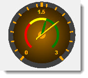
The AutoTick property value set to False is used in conjunction with the Interval property—the set number of intervals between tick marks. GainSeeker automatically calculates a practical tick mark count for a gage based on the Interval property value and the current retrieval when the AutoTick is set to False.
In this example, the AutoTick value has been set to False. A 1.5 Interval rate has been user-set.
Using this value and the current data, GainSeeker uses three tick marks and two intervals of 1.5 for the gage:
Also see setting the ValueMinimum and ValueMaximum properties
The AutoMaximumTicks property is used in conjunction with the AutoTick property set to True. GainSeeker calculates a practical interval rate and tick mark count for a gage based on these settings.
![]()
The Interval subproperty under the TickMarks property is used in conjunction with the AutoTick property set to False. The Interval is the numeric interval used between tick marks. GainSeeker calculates a practical tick mark count for a gage based on the Interval property value and the current data retrieval when the AutoTick is set to False.
The value indicator ![]() points to the actual data reading on a gage. Use the ValueIndicator property in the Scale category of the Properties dialog to edit the statistic or value to which the value indicator points. Other characteristics such as the type of indicator the gage will display—arrow, pointer, or triangle—can also be changed.
points to the actual data reading on a gage. Use the ValueIndicator property in the Scale category of the Properties dialog to edit the statistic or value to which the value indicator points. Other characteristics such as the type of indicator the gage will display—arrow, pointer, or triangle—can also be changed.
To set the Value subproperty:
Click the ellipsis button in the Value subproperty value cell under ValueIndicator.
The Pick a Statistic or Number Value dialog opens. See Using the Pick a Statistic or Number Value dialog.
See Setting the Target properties for information on setting target indicators.
Also see setting the ValueMaximum property and setting the ValueMinimum property.
Set the maximum (ending) value for the gage range, for example, 0 to 3 with 3 being the maximum (or ending) point on a gage, using the ValueMaximum property. Another of many examples would be to set the ValueMaximum to Upper Gate and set the ValueMinimum to Lower Gate to establish a range. See Setting Maximum, Minimum, and Target values for a Dial Gage
To set the ending value for the Dial Gage:
The Pick a Statistic or Number Value dialog opens. See Using the Pick a Statistic or Number Value dialog.
Use the ValueMinimum property to set the minimum (starting) value for the gage range, for example 0 to 3 with 0 being the minimum (or beginning) point. Another of many options would be to set the ValueMinimum to Lower Gate and the ValueMaximum to Higher Gate. See Setting Maximum, Minimum, and Target values for a Dial Gage
To set the starting value to display on the Dial Gage:
The Pick a Statistic or Number Value dialog opens. See Using the Pick a Statistic or Number Value dialog.
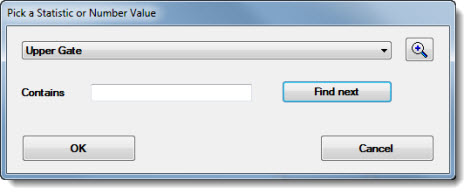
Click a statistic or a value from the drop-down list to select it for the designated value. The lists will vary depending on whether SPC or DMS data was selected for the Dial Gage and depending on which value (ValueIndicator, ValueMaximum, or ValueMinimum) is being set. Options for the latter two include a User-defined number option. If this option is selected, the dialog will display a Number text field in which a numeric value can be entered in the field.
Then, click OK after a selection is made.
For information on selecting statistics, see SPC statistics available
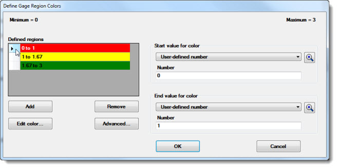
On the above example, the dialog has three defined regions—red, yellow, and green—as shown in the Defined regions grid. More regions can be added using the Add button or removed using the Remove button.
The red bar in the example is selected for edit as indicated by the highlighted arrow in the cell preceding the color bar.
The Start value for color drop-down list has been set to the User-defined number and given a value of 0 in the Number text field for this region. The End value for color drop-down list has been set to the User-defined number setting and given a value of 1 in the Number text field for this region. (Other statistics can also be selected from the drop-down lists.) Thus, the range setting for the red bar is 0 to 1; the yellow bar, 1 to 1.67; and the green bar, 1.67 to 3.
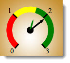
Using this scenario, the Dial Gage region colors may look similar to this on a gage displaying Cpk data.
Using the Advanced... button
Use the Advanced button on the Define Gage Region Colors dialog to distinguish a region by offsetting it or widening or narrowing it on the gage.
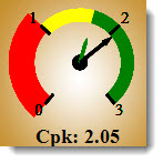
In this example, the red region color bar is offset from the radius and widened:
To edit a region color bar on a gage using advanced settings:
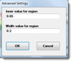
The Advanced Settings dialog opens.
To move a Defined region color bar closer or farther from the center of the gage:
To widen or narrow a region color bar on a gage:
