The GainSeeker Charts module features multiple options for versatile dashboard design that were developed specifically for GainSeeker Suite users.
|
Contents [Hide] |
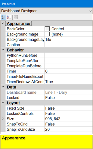
The Properties dialog opens anytime the dashboard window is open in design/edit mode. it is used to change settings for a dashboard window.

You can add a background image to a dashboard window.
To add an image:
 in the BackgroundImage property
value cell in the Properties
dialog. Then, select an image to display from the Open
dialog that displays.
in the BackgroundImage property
value cell in the Properties
dialog. Then, select an image to display from the Open
dialog that displays.To remove a selected image from the background of the control:
Note: You can use the BackroundImageLayout property to determine how the image displays:
You can use the Caption property in the Appearance section to display a label that is different from the name of the dashboard, in these areas:
the text displayed at the top of the dashboard window
the text displayed on the tab for this dashboard
the default subject line used when this dashboard is sent to Email
HTML title applied when this dashboard is sent to HTML
If the Caption property is left blank, these areas will display the name of the dashboard.
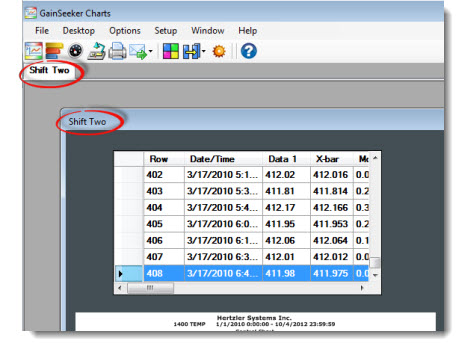
To set a Caption for the dashboard, click the value cell opposite the Caption property. Then, type the text for the caption in the value cell.
To remove the Caption for a dashboard, click the value cell. Then, select all the caption text and delete it from the cell.
|
Note: GainSeeker Server Edition is required for the PythonRunAtRefresh, PythonRunBefore, TemplateRunAfter, TemplateRunBefore, and TimerFileNameExport properties.
PythonRunAtRefresh. Run a Python script before the dashboard opens or refreshes.
PythonRunBefore. Run a Python script once before the dashboard opens.
TemplateRunAfter. Run a template after the dashboard opens or refreshes.
TemplateRunBefore. Run a template before the dashboard opens or refreshes.
Timer. Set a dashboard—and all or some of its individual components—to refresh at a time interval that corresponds with data entry schedules.
TimerFileNameExport. Save the file name where you want a screen capture ("snapshot") image of a refreshed dashboard or control to be stored until the next refresh session.
TimerRedrawsAllControls. Refresh all dashboard controls along with the dashboard option.
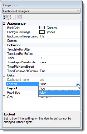
On the Properties dialog, set the Locked property value in the Data category to True to lock a dashboard so that its properties can only be changed by users whose role is set to enable changing of locked items. Those who do not have rights will receive an informational dialog stating that the dashboard is locked if they attempt to change it.
Click the dashboard name in the list field of the Open Dashboard dialog
Click the Edit... button on the dialog. That dashboard will open in design/edit mode where you can make changes to the properties. For more information, see Editing a dashboard window
 Even
if you have rights to change locked items, you will be unable to switch
a dashboard to design/edit mode from run (view) mode using the right-click
menu Design Dashboard... option
for that dashboard. Refer to steps 1 and 2 above for information about
opening a locked dashboard in design/edit mode to make changes to it.
You can use the Show locked... button on the Open Dashboard dialog to display a list of saved dashboards to which you have access that are locked. For more information, see Show locked...
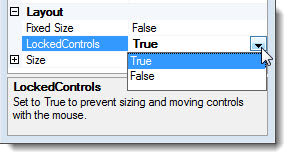
If you are creating a dashboard with multiple controls similar to this example, you may want to size and position your finished controls before creating the next dashboard control. The LockedControls property allows you to lock all the dashboard controls on a dashboard so you do not accidentally resize or move them around with your mouse as you are working in design/edit mode.
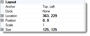
With the property set to True, you will still be able to resize or move any of the controls using these controls properties:
When SnapToGrid is enabled, GainSeeker will automatically adjust the size and location of dashboard controls so that their edges line up with a design grid. You can also adjust the size of that design grid.
The effect on any one dashboard control may be to make it larger or smaller, and to shift its location up or down and right or left.
To enable SnapToGrid, change the SnapToGrid property to True.
To change the number of pixels between grid lines, increase or decrease the number in the SnapToGridSize property.
When the SnapToGrid property is set to True, the SnapToGrid functionality will automatically adjust:
the size and location of new controls that you add to the dashboard.
the size and location of existing controls on the dashboard.
When you change the SnapToGrid property to True, the size and location of any existing dashboard controls will be immediately adjusted to the nearest grid line.
When the SnapToGrid property is already set to True, and you change the SnapToGridSize property, the size and location of any existing dashboard controls will be immediately adjusted to the nearest grid line.
the size of controls that you resize - either by clicking and dragging the edge or by changing the Size properties of the control.
the location of controls that you move - either by dragging the control on the canvas or by changing the Location properties of the control - even if the LockedControls property is set to True.
 Several
properties of some dashboard controls can override aspects of the SnapToGrid
functionality:
If a Date Time, Static Text, Dynamic Text, or Button control has the AutoSize property set to True, the SnapToGrid functionality will automatically adjust that control's location but not its size.
If an Image control has the SizeMode property set to AutoSize, the SnapToGrid functionality will automatically adjust that control's location but not its size.
Some controls have Anchor and Dock properties, and some settings for these properties will override the SnapToGrid functionality.