![]() Run a file or template, load a dashboard, desktop, or run a PC Collect inspection or Python script any time the Button dashboard control is clicked on a dashboard in run mode. The background color of the Button can also serve as an alert for an out-of-range statistic.
Run a file or template, load a dashboard, desktop, or run a PC Collect inspection or Python script any time the Button dashboard control is clicked on a dashboard in run mode. The background color of the Button can also serve as an alert for an out-of-range statistic.
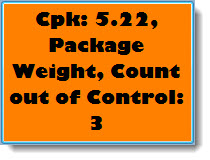
For this example of a Button control, the color red is assigned as an alert that a specified number of samples are out of control. See Editing the BackColorRegions property for more information
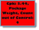
When the Button control itself is clicked on the dashboard, it is set to display a saved dashboard that displays more information about what led to the out-of-control situation in this example:
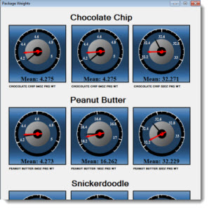
This control can automatically refresh at a time interval you define or it can refresh along with the dashboard window.
Some of the Button control properties (attributes) may be familiar in usage and may not require additional explanation. Many of the properties featured in this topic are specifically designed for GainSeeker users.
See Using the Properties dialog
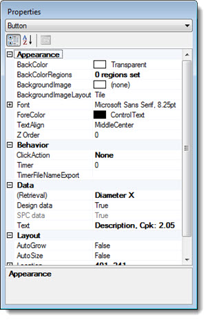

The Dashboard Control Retrieval dialog opens.
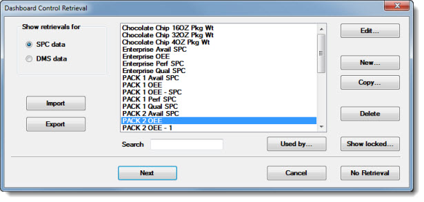
Click the name of a preexisting retrieval to select it or create a new retrieval. See Using the Dashboard Control Retrieval dialog for more information on the dialog options, including importing, exporting, editing, creating, and copying retrievals.
|
|
Click Next or OK on the Dashboard Control Retrieval dialog after a retrieval is selected.
The Set Label Text dialog opens. Add any user-defined text or select the statistics to display on the control. Then, click OK. See Using the Set label Text dialog

The control opens on the host dashboard in design/edit mode, displaying the selected statistic labels. The Properties dialog menu changes to display the Button control setting and the properties grid displays the properties specific to this control for which the property values can be changed.
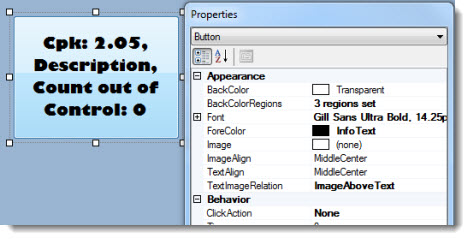
However, when this control is saved in design/edit mode and later redrawn on its host dashboard window in run mode, it may look similar to this example, depending on whether there are BackColorRegions property settings assigned to it.
For this Button, the color red was user-assigned to serve as an alert when a specified number of samples are out of control. See Editing the BackColorRegions property for more information.

Define background colors for the button to indicate user-specified data conditions using the BackColorRegions property.
For this Button control, the color red was user-assigned to serve as an alert when a specified number of samples are out of control.
Likewise, the Button background color might be set to green when conditions fall within a user-specified acceptable range, or yellow or orange, for example, when conditions are between the acceptable and unacceptable range. See Using the Define BackColor Regions dialog:

To edit the BackColorRegions property value cell:
Click the BackColorRegions property value cell under Appearance.
Then, click the ellipsis button ![]() in the value cell.
in the value cell.
The Define BackColor Regions dialog opens.
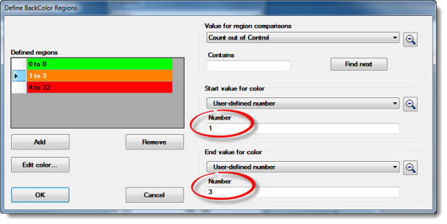
On the above example, the Define BackColor Regions dialog has three defined background color regions—green, orange, and red—as shown in the Defined regions grid.
The orange bar in the example is selected for edit as indicated by the highlighted arrow in the cell. The start value for color Number field is set to 1 and the End value for color Number field is set to 3 (as circled in red).
Thus, the range setting for the orange bar is 1 to 3. Count out of control is the statistic selected on the Value for region comparisons drop-down list in this example. So when 1 to 3 samples are out of control, the Button background turns orange. Likewise, it turns red or green when the user-set conditions for those background colors are met in this example.
Value for region comparisons, Start value for color, and End value for color drop-down lists in the Define BackColor Regions dialog each feature advanced search option features.
To display close matches to a search word or phrase:
Enter any part of a word or phrase in the Contains text field. Then, click Find next. Statistics containing all or part of the word or phrase display.

|
|
Click the Add button to add a new defined region to the Defined regions grid. Each displays default values that be changed. Repeat until the wanted number of regions display in the grid.
Click the cell preceding a defined region to select it for edit, which is indicated by an arrow ![]() in a highlighted cell.
in a highlighted cell.
The statistic parameters and background colors can be set for the selected region.
Click a statistic for comparisons from the Value for region comparisons drop-down list.
Click a statistic in the Start value for color drop-down list. Or, click User-defined number in the drop-down list and enter a numeric value in the Number field that displays.
Click a statistic in the End value for color drop-down list. Or, click User-defined number in the drop-down list and enter a numeric value in the Number field that displays.
Click the cell preceding a defined region to select it for edit, which is indicated by an arrow ![]() in a highlighted cell.
in a highlighted cell.
Click the Edit color... button.
The Color dialog opens.
Click a color to select it. Then, click OK.
See Timer for information on setting an automatic refresh rate interval so the control displays the latest available data.
You can add a background image to a Button dashboard control.
To add an image:
To remove a selected image from the background of the control:
Run a File, Template, Planned or Stored session, Inspection, or Python Script, or Load a Dashboard or Desktop any time the Button dashboard control is clicked on a dashboard in run mode.
To set the ClickAction property:
Click the ClickAction property value cell in the Behavior category on the Properties dialog.
Then, click the ellipsis button ![]() in the cell.
in the cell.
The Select Action Item dialog opens.
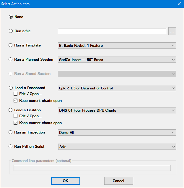
Click an options button to select the ClickAction item on the Select Action Item dialog. Then, click an item on the drop-down list to select it.
For the Run a File option, click the ellipsis button ![]() and a Select Application or File to Run dialog opens. Select a file or application. Then, click Open on that dialog.
and a Select Application or File to Run dialog opens. Select a file or application. Then, click Open on that dialog.
For dashboards and desktops:
The Edit/Open check box for lets you open a dashboard with changes or open a desktop with changes.
If both the Edit/Open and Keep Current Charts Open check boxes are selected for a dashboard, all chart windows are closed before the Edit Dashboard Settings window is displayed for the specified dashboard.
If both the Edit/Open and Keep Current Charts Open check boxes are selected for a desktop, the Edit Desktop Settings window is displayed for the specified desktop. After the user specifies any changes and clicks OK, all chart windows are closed and the desktop is opened with any specified changes.
See Using Command line parameters with a ClickAction below for information about using the Command line parameters (optional) field with any of these options.
You can optionally use command line parameters to have GainSeeker perform automatic functions when the Button dashboard control is clicked. You can choose to Run a File, Run a Template, Run a Planned Session, Run a Stored Session, Run an Inspection or Run Python Script options on the Select Action Item dialog. See Editing the ClickAction property above.
Tips:
Include only parameters in the command line that you want GainSeeker to automatically execute.
Insert a blank space between parameters in the command line.
For more information, see Setting up shortcuts to perform automatic functions
To edit the Text property value to change the statistics labels and the display format of the Button:
Click the Text property value cell under Data. Then, click the ellipsis button ![]() in the cell.
in the cell.

The Set Label Text dialog opens. See Using the Set Label Text dialog