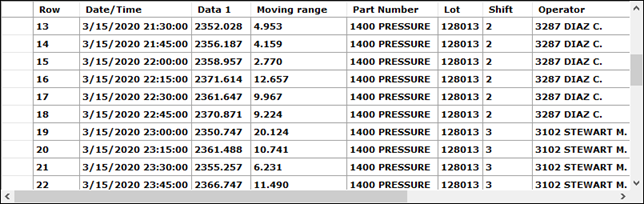
The Data Table dashboard control displays a GainSeeker data table on the dashboard window.
The (Data Columns) property lets you select which columns of data to display on the control.
For SPC data, the DataTableType property lets you choose one of three types of data tables.
A right-click menu for the control offers options for converting this data into a GainSeeker chart or full-size data table for deeper analysis.
This control can automatically refresh at a time interval you define or it can refresh along with the dashboard window.
|
Contents [Hide] |
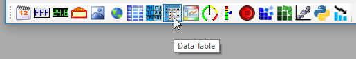
On a dashboard window that is open in design/edit
mode, click the Data Table
button on the dashboard controls
toolbar.
On the Dashboard Control Retrieval window,
select a retrieval and then click Next.
This adds the Data Table control to the dashboard window.
Move this control to the desired location.
Edit the properties for this control.
There are two ways to change the location of this control on a dashboard window that is open in design/edit mode,
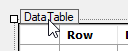
Click and drag the Data Table
tab on the control to move it to a new location on the dashboard window.
Edit this control's Layout properties such as Anchor, Dock, and Location.
There are two ways to select this control so that you can edit its properties (when the dashboard is open in design/edit mode):
Click the Data Table
tab on the control.
Click the Properties window drop-down menu and select the Data Table control.
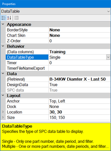
Significant properties for this control include:
Property |
Default setting or default display |
Allows |
Appearance |
||
BorderStyle |
None: No border is displayed around the outside edge of this control. |
Choose the style of border to display. |
None: Default display settings are applied to this data table. |
Select a chart skin to apply its Chart override settings such as colors, fonts, etc. |
|
Z-Order |
0: Lowest priority when overlapped by other controls. |
When objects overlap or when the dashboard is saved as an .rtf file (such as when sending to Word or WordPad), a control with a higher Z-Order will be displayed and exported above a control with a lower Z-Order. Enter a number to specify the order you want for this control in relation to other controls on the same dashboard. |
Behavior |
||
Determines which table columns are displayed and in what order. In most cases, the default data table columns are set by the SPC default reports or DMS default reports for the configuration. The exception is when this control's DataTableType property is MultipleWithMatchedColumns, in which case the data table columns are determined by this control's Chart Skin property (Columns used to match rows from different retrievals setting) and this property is set to N/A. |
You can select a different SPC format or DMS format (except when this property is N/A). For an SPC retrieval, the list of report formats when the DataTableType property set to Single is different from when that property is set to Multiple. |
|
|
For an SPC retrieval, you can change this to one of the following:
|
|
0: Do not set a timer to automatically refresh this control with the latest data. Refreshing the entire dashboard window can still refresh this control. |
Set the number of seconds to elapse before automatically refreshing this control. |
|
[blank] |
If you have GainSeeker Server Edition, you can save an image of this control to a file each time this control is refreshed by this control's Timer property or by the Dashboard window's Timer property. To use this feature, click this property and then click the
ellipsis button
To turn off this feature, select the file name in the value field and delete it. |
|
Data |
||
The retrieval you selected when adding this control to the dashboard. |
Select a different retrieval for this control.
|
|
DesignData |
True: While you are designing/editing the dashboard, display fictional "data" instead of waiting for this control to retrieve actual data from your GainSeeker database and calculate statistics. When running the dashboard, users will see the actual data and statistics from the retrieval, not this fictional "data". |
False: While you are designing/editing the dashboard, retrieve the actual data from your GainSeeker database and calculate statistics. This takes more time than using the fictional "data", but you can see exactly how the control will look when running the dashboard, and you may find it easier to fine-tune the properties of this control. This option is only used temporarily until you stop using design/edit mode; each time you open the dashboard in design/edit mode, this property is automatically reset to True. |
SPC Data |
|
You cannot change this property. |
Layout |
||
Anchor |
Top, Left: When the dashboard window is resized:
|
You can select or clear any combination of the Top, Bottom, Left, and Right edges. When the dashboard window is resized:
|
Dock |
None |
You can align this control to one edge of the dashboard window and autosize the control to match the size of that window edge. or set it to fill the remaining space in the dashboard window. If multiple controls on this dashboard are docked, they will be aligned to each other and resize as a group. The order in which controls are added to the dashboard affect the priority in which they are docked. Choose from Top, Left, Right, Bottom, Fill (fills the dashboard window), or the default None (not docked). |
Location |
[varies] |
You can manually set the desired X (horizontal) and Y (vertical) pixel coordinates of the upper-left corner of the control relative to the upper-left corner of the dashboard window. |
Size |
[varies] |
You can manually set the Width and Height in pixels for this control. |
 . Use
the
. Use
the